
import React from 'react'
import { Button } from 'semantic-ui-react'

const ButtonExampleShorthand = () => <Button content='Click Here' />

export default ButtonExampleShorthand
When you click on the button, it becomes gray and stays so unless you click somewhere else. Is it possible to make it return to the initial state(light gray) right after you clicked?
Advertisement
Answer
Any <button> (not just ones from Semantic-UI) has a number of different states it can be in. These states can be selected and styled with pseudo-classes in CSS.
:hover is when you move your mouse over the button
:active is when you have clicked down on the button but not yet released your click.
:focus is when a user has used the tab key to focus their browser on that element.
The issue you refer to in your question arises because clicking on a button sets the browser’s focus on that button. This focus remains after you release your click and move your mouse off of the button.
If the styles for your button are the same for :active and for :focus it will appear as if the button is still clicked (but really the button just has the browser’s focus which is affecting the styling). Clicking elsewhere on the page removes the browser’s focus from the button and therefore updates the styling.
A NOT recommended solution is to just have the :focus styling match the styling when the button is not active, hovered, or focused. But, this is discouraged because assistive technologies rely on focus to work correctly. If no styling changes occur with :focus a keyboard-only user will not be able to utilize your site.
In React, you’ll need to utilize createRef (or useRef for functional components) to manage focus around a button. The Semantic-UI-react docs have an example that will be helpful. Note that the behavior you are describing also occurs with their example button. The React docs also have some clear explanations of the ideas around this issue.
To better understand focus, hover, and active, I recommend this post which has excellent interactive examples that clarify the different states and how they interact.
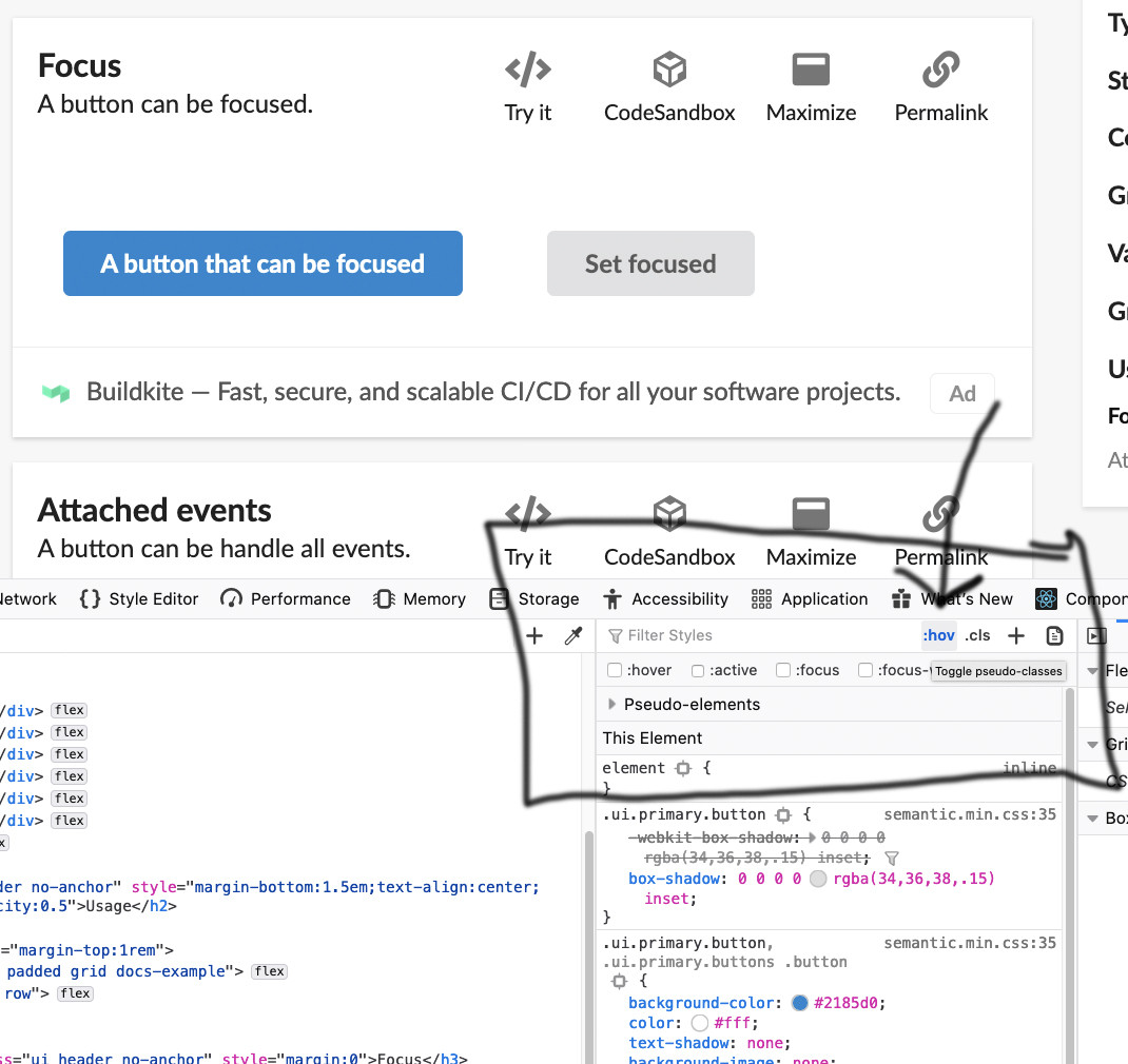
It’s also worth pointing out that Firefox, Chrome (and likely other browsers with developer features) have a tool where you can toggle/test the states of elements.