

I have a navbar with 3 flex items as shown below, and I can’t seem to figure out how to center the containers when vertically collapsed.

When I shrink the browser this is the result –
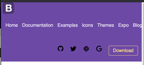
How do I center the B logo as well as the icons container at the bottom to be vertically centered to the middle when the browser collapses?
The code is below:
    <nav class = "navlinks">

    <img src="/bootstrap-clone/Images/bootstrap-logo-3C30FB2A16-seeklogo.com.png" alt="bootstraplogo" id="bootstraplogo">

    <ul class="leftbar">
        <li><a href="#"> Home</a></li>
        <li><a href="#"> Documentation</a></li>
        <li><a href="#"> Examples</a></li>
        <li><a href="#"> Icons</a></li>
        <li><a href="#"> Themes</a></li>
        <li><a href="#"> Expo</a></li>
        <li><a href="#"> Blog</a></li>
      </ul>


    <ul class="rightbar">
      <li><a href="#"><img src="/bootstrap-clone/Images/github.svg" alt="github"></a></li>
      <li><a href="#"><img src="/bootstrap-clone/Images/twitter.svg" alt="twitter"></a></li>
      <li><a href="#"><img src="/bootstrap-clone/Images/slack.svg" alt="slack"></a></li>
      <li><a href="#"><img src="/bootstrap-clone/Images/google.svg" alt="google"></a></li>
      <li><a href="#"><button class="btn download">Download</button></a></li>
    </ul>

  </nav>

  </header>
    background-color: white;
    margin:0;
    padding:0;
    font-family:Arial, Helvetica, sans-serif
}

.navlinks {
    display: flex;
    justify-content: left;
    align-items: center;
    padding: 0px;
    background-color: rgb(121,82,179);
    height: auto;
    flex-wrap: wrap;
  }

  .leftbar{
      padding: 10px;
      flex-shrink: 0;
  }

  .leftbar li {
    display: inline-block;
    padding: 5px;
  }

  .leftbar li a {
    text-decoration: none;
    color: rgb(236,231,244);
    font-family: Helvetica, sans-serif;
    font-weight:400;
  }

  .rightbar li {
      display:inline-block;
      padding: 8px;
      padding-bottom: 0px;
  }

  .rightbar{
    margin-left: auto;
    padding: 5px;
  }
Advertisement
Answer
simply using pure CSS ‘s media queries:
@media only screen and (max-width: 992px) {
    .navlinks{
        justify-content: center;
        text-align: center;
        flex-direction: column;
    }
    ul{
        margin: auto;
    }
}