
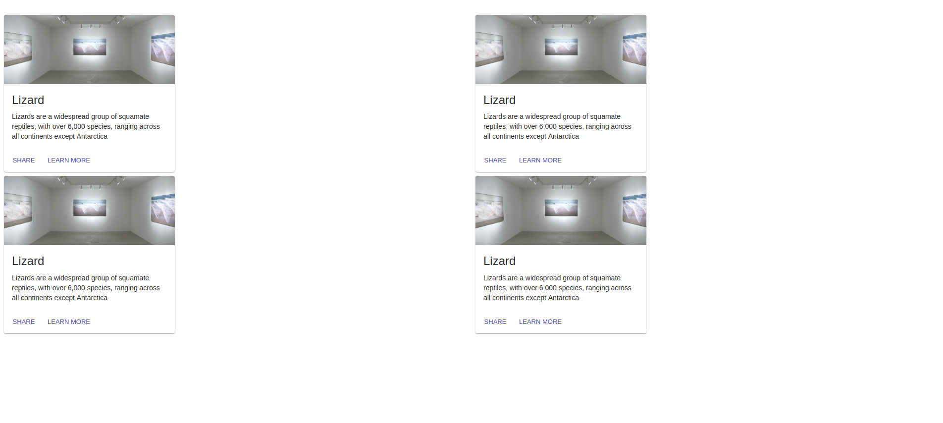
I want to use same cards and make them center aligned, I searched and tried some solutions but all of them align only the component grid, and not the component content itself (I need them to be equally distant form the borders and from themselves).
I’m using this code (https://codesandbox.io/embed/32o8j4wy2q):
<Grid
      container
      spacing={0}
      direction="column"
      alignItems="center"
      justify="center"
      style={{ minHeight: '80vh' }}>
      <Grid container item xs={12} spacing={8}>
        <Grid item xs={6}>
          <Card />
        </Grid>
        <Grid item xs={6}>
          <Card />
        </Grid>
        <Grid item xs={6}>
          <Card />
        </Grid>
        <Grid item xs={6}>
          <Card />
        </Grid>
      </Grid>
    </Grid>
The card code is irrelevant but I just copied the material-ui’s example one.
Also, how do I use flexboxes (or other tool) to auto align if I decide in the future to add or remove some cards?
Advertisement
Answer
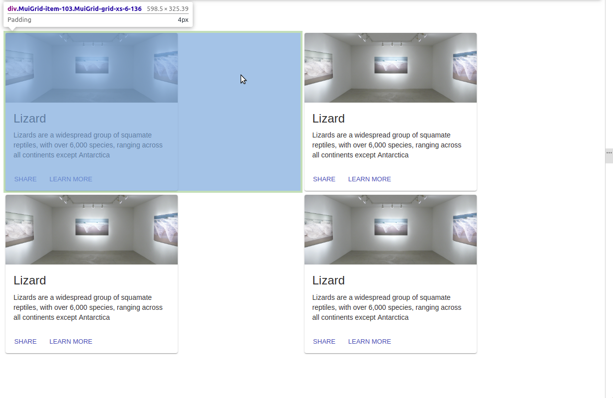
I soved it by adding align="center" in the JSX code that means align-items: center in CSS as explained here.
The code was done like this:
  <Fragment>
    <Grid
      container
      spacing={24}
      justify="center"
      style={{ minHeight: '100vh', maxWidth: '100%' }}
      >
     <Grid item xs={3} align="center">
        <Card />
      </Grid>
      <Grid item xs={3} align="center">
        <Card />
      </Grid>
      <Grid item xs={3} align="center">
        <Card />
      </Grid>
      <Grid item xs={3} align="center">
        <Card />
      </Grid>
    </Grid>
  </Fragment>