

So I have been trying to split my ordered list, which contains skill names, into two columns, but the columns are not on the equal level. I tried to fix it by adding padding and margins as such, but it doesn’t work.
Here’s my code –
.ss {
  background-color: rgba(67, 55, 76, 0.99);
  background-image: linear-gradient(to bottom right, #f54171, #29c450de 2100px);
  position: relative;
}

.ss::before {
  position: absolute;
  z-index: 100;
  top: 0;
  left: 0;
  display: block;
  width: 100%;
  height: 500px;
  content: " ";
  background-image: -webkit-gradient(linear, left bottom, left top, from(rgba(0, 0, 0, 0)), to(rgba(0, 0, 0, 0.1)));
  background-image: linear-gradient(to top, rgba(0, 0, 0, 0), rgba(0, 0, 0, 0.1));
}

.ss::after {
  position: absolute;
  z-index: 50;
  bottom: 0;
  left: 0;
  display: block;
  width: 100%;
  height: 1077px;
  content: " ";
  background-image: url("../img/section_pattern01.png");
  opacity: 1;
  background-position: -80px 50px;
}

.ss_hollow-arrow {
  width: 100%;
  height: 40px;
  background-image: url("../img/content_hollow-arrow.png");
  background-position: 50% 50%;
  position: relative;
  top: -40px;
  left: 0;
  opacity: 1;
}

.ss_wrapper {
  position: relative;
  z-index: 200;
  width: 100%;
  max-width: 1200px;
  margin: 0 auto;
  padding-top: 110px;
  padding-bottom: 200px;
}

ol.gradient-list>li,
ol.gradient-list>li::before {
  box-shadow: 0.25rem 0.25rem 0.6rem rgba(0, 0, 0, 0.05), 0 0.5rem 1.125rem rgba(75, 0, 0, 0.05);
}

ol {
  columns: 2;
  -webkit-columns: 2;
  -moz-columns: 2;
  display: flexbox;
}

ol.gradient-list {
  counter-reset: gradient-counter;
  list-style: none;
  margin: 1.75rem 0;
  padding-left: 25%;
  font-weight: bold;
  font-size: 25px;
  padding-top: 8%;
  width: fit-content;
  align-content: center;
}

ol.gradient-list>li {
  background: white;
  border-radius: 0 0.5rem 0.5rem 0.5rem;
  counter-increment: gradient-counter;
  margin-top: 1rem;
  min-height: 3rem;
  padding: 1rem 1rem 1rem 3rem;
  position: relative;
  text-align: center;
  -webkit-column-break-inside: avoid;
  page-break-inside: avoid;
  break-inside: avoid;
}

ol.gradient-list>li::before {
  align-items: center;
  content: counter(gradient-counter);
  color: #1d1f20;
  display: flex;
  font-size: 25px;
  justify-content: flex-end;
  padding: 0.125em 0.25em;
  z-index: 1;
  font-weight: bold;
}

ol.gradient-list>li:nth-child(10n+1):before {
  background: linear-gradient(135deg, rgba(7, 207, 233, 0.534) 0%, rgba(221, 7, 96, 0.726) 100%);
}

ol.gradient-list>li:nth-child(10n+2):before {
  background: linear-gradient(135deg, rgba(162, 237, 86, 0.4) 0%, rgba(253, 220, 50, 0.4) 100%);
}

ol.gradient-list>li:nth-child(10n+3):before {
  background: linear-gradient(135deg, rgba(162, 237, 86, 0.6) 0%, rgba(253, 220, 50, 0.6) 100%);
}

ol.gradient-list>li:nth-child(10n+4):before {
  background: linear-gradient(135deg, rgba(162, 237, 86, 0.8) 0%, rgba(28, 128, 209, 0.8) 100%);
}

ol.gradient-list>li:nth-child(10n+5):before {
  background: linear-gradient(135deg, rgb(56, 95, 201) 0%, rgb(206, 75, 108) 100%);
}

ol.gradient-list>li:nth-child(10n+6):before {
  background: linear-gradient(135deg, rgba(192, 45, 101, 0.8) 0%, rgba(27, 167, 155, 0.8) 100%);
}

ol.gradient-list>li:nth-child(10n+7):before {
  background: linear-gradient(135deg, rgba(162, 237, 86, 0.6) 0%, rgba(253, 220, 50, 0.6) 100%);
}

ol.gradient-list>li:nth-child(10n+8):before {
  background: linear-gradient(135deg, rgba(162, 237, 86, 0.4) 0%, rgba(253, 220, 50, 0.4) 100%);
}

ol.gradient-list>li:nth-child(10n+9):before {
  background: linear-gradient(135deg, rgba(162, 237, 86, 0.2) 0%, rgba(253, 220, 50, 0.2) 100%);
}

ol.gradient-list>li:nth-child(10n+10):before {
  background: linear-gradient(135deg, rgba(162, 237, 86, 0) 0%, rgba(253, 220, 50, 0) 100%);
}

ol.gradient-list>li+li {
  margin-top: 2rem;
  font-weight: bold;
  font-size: 25px;
}

ol.listitem {
  text-align: center;
}
<section id="softskill" class="ss">
<div class="ss_wrapper">
<div class="section-header">
<div class="section-header__title section-header__title--softskill">My Soft Skills...</div>
<div class="section-header__subtitle">Software and technologies that I'm experienced in</div>
</div>
<ol class="gradient-list">
<li>Communication Skills</li>
<li>Time Management</li>
<li>Critical Thinking</li>
<li>Creative Thinking</li>
<li>Leadership Skills</li>
<li>Disciplined</li>
<li>Positive Attitude</li>
<li>Confidence</li>
<li>Problem Solving</li>
<li>Active Listening</li>
</ol>
<table>
</table>
</div>
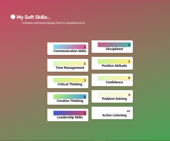
</section>The Output – Contains output of given code snippet as per my website
Sorry for the messy CSS. Please help me figure out what I have been doing wrong.
PS – I tried using js to separate it into two columns as given in other answers of similar question, but it doesn’t work.
Advertisement
Answer
As said in the comments, you can remove the margin-top: 1rem; from ol.gradient-list>li (open snippet in full-page mode to see it properly).
.ss {
  background-color: rgba(67, 55, 76, 0.99);
  background-image: linear-gradient(to bottom right, #f54171, #29c450de 2100px);
  position: relative;
}

.ss::before {
  position: absolute;
  z-index: 100;
  top: 0;
  left: 0;
  display: block;
  width: 100%;
  height: 500px;
  content: " ";
  background-image: -webkit-gradient(linear, left bottom, left top, from(rgba(0, 0, 0, 0)), to(rgba(0, 0, 0, 0.1)));
  background-image: linear-gradient(to top, rgba(0, 0, 0, 0), rgba(0, 0, 0, 0.1));
}

.ss::after {
  position: absolute;
  z-index: 50;
  bottom: 0;
  left: 0;
  display: block;
  width: 100%;
  height: 1077px;
  content: " ";
  background-image: url("../img/section_pattern01.png");
  opacity: 1;
  background-position: -80px 50px;
}

.ss_hollow-arrow {
  width: 100%;
  height: 40px;
  background-image: url("../img/content_hollow-arrow.png");
  background-position: 50% 50%;
  position: relative;
  top: -40px;
  left: 0;
  opacity: 1;
}

.ss_wrapper {
  position: relative;
  z-index: 200;
  width: 100%;
  max-width: 1200px;
  margin: 0 auto;
  padding-top: 110px;
  padding-bottom: 200px;
}

ol.gradient-list>li,
ol.gradient-list>li::before {
  box-shadow: 0.25rem 0.25rem 0.6rem rgba(0, 0, 0, 0.05), 0 0.5rem 1.125rem rgba(75, 0, 0, 0.05);
}

ol {
  columns: 2;
  -webkit-columns: 2;
  -moz-columns: 2;
  display: flexbox;
}

ol.gradient-list {
  counter-reset: gradient-counter;
  list-style: none;
  margin: 1.75rem 0;
  padding-left: 25%;
  font-weight: bold;
  font-size: 25px;
  padding-top: 8%;
  width: fit-content;
  align-content: center;
}

ol.gradient-list>li {
  background: white;
  border-radius: 0 0.5rem 0.5rem 0.5rem;
  counter-increment: gradient-counter;
  min-height: 3rem;
  padding: 1rem 1rem 1rem 3rem;
  position: relative;
  text-align: center;
  -webkit-column-break-inside: avoid;
  page-break-inside: avoid;
  break-inside: avoid;
}

ol.gradient-list>li::before {
  align-items: center;
  content: counter(gradient-counter);
  color: #1d1f20;
  display: flex;
  font-size: 25px;
  justify-content: flex-end;
  padding: 0.125em 0.25em;
  z-index: 1;
  font-weight: bold;
}

ol.gradient-list>li:nth-child(10n+1):before {
  background: linear-gradient(135deg, rgba(7, 207, 233, 0.534) 0%, rgba(221, 7, 96, 0.726) 100%);
}

ol.gradient-list>li:nth-child(10n+2):before {
  background: linear-gradient(135deg, rgba(162, 237, 86, 0.4) 0%, rgba(253, 220, 50, 0.4) 100%);
}

ol.gradient-list>li:nth-child(10n+3):before {
  background: linear-gradient(135deg, rgba(162, 237, 86, 0.6) 0%, rgba(253, 220, 50, 0.6) 100%);
}

ol.gradient-list>li:nth-child(10n+4):before {
  background: linear-gradient(135deg, rgba(162, 237, 86, 0.8) 0%, rgba(28, 128, 209, 0.8) 100%);
}

ol.gradient-list>li:nth-child(10n+5):before {
  background: linear-gradient(135deg, rgb(56, 95, 201) 0%, rgb(206, 75, 108) 100%);
}

ol.gradient-list>li:nth-child(10n+6):before {
  background: linear-gradient(135deg, rgba(192, 45, 101, 0.8) 0%, rgba(27, 167, 155, 0.8) 100%);
}

ol.gradient-list>li:nth-child(10n+7):before {
  background: linear-gradient(135deg, rgba(162, 237, 86, 0.6) 0%, rgba(253, 220, 50, 0.6) 100%);
}

ol.gradient-list>li:nth-child(10n+8):before {
  background: linear-gradient(135deg, rgba(162, 237, 86, 0.4) 0%, rgba(253, 220, 50, 0.4) 100%);
}

ol.gradient-list>li:nth-child(10n+9):before {
  background: linear-gradient(135deg, rgba(162, 237, 86, 0.2) 0%, rgba(253, 220, 50, 0.2) 100%);
}

ol.gradient-list>li:nth-child(10n+10):before {
  background: linear-gradient(135deg, rgba(162, 237, 86, 0) 0%, rgba(253, 220, 50, 0) 100%);
}

ol.gradient-list>li+li {
  margin-top: 2rem;
  font-weight: bold;
  font-size: 25px;
}

ol.listitem {
  text-align: center;
}
<section id="softskill" class="ss">
<div class="ss_wrapper">
<div class="section-header">
<div class="section-header__title section-header__title--softskill">My Soft Skills...</div>
<div class="section-header__subtitle">Software and technologies that I'm experienced in</div>
</div>
<ol class="gradient-list">
<li>Communication Skills</li>
<li>Time Management</li>
<li>Critical Thinking</li>
<li>Creative Thinking</li>
<li>Leadership Skills</li>
<li>Disciplined</li>
<li>Positive Attitude</li>
<li>Confidence</li>
<li>Problem Solving</li>
<li>Active Listening</li>
</ol>
<table>
</table>
</div>
</section>Note that your code can be improved in many ways. I would suggest posting it at Code Review for further feedback.