
How do you pin a Bootstrap navbar to the top of the screen? I’ve tried importing JS code but it doesn’t seem to work and the worst part is, it glitches trying to stick to the top when it is implemented, but when you scroll down, it is not actually a sticky navbar. Is there a practical way to fix this?
Also, when you change the dimensions so that they are smaller, the navbar goes into hamburger layout. Then, when you hover over it, there is a dark black shadow/background over the hamburger button icon. How can we get rid of that? If there is someone who has expertise with the navbar, that would be much appreciated.
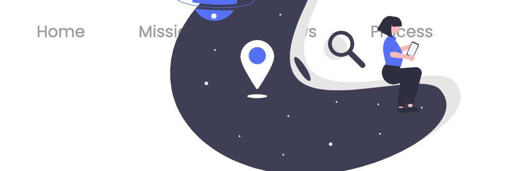
Edit: Both issues have been resolved. I do have a question about making it so that when the user scrolls down, the navbar does not pass under images as is shown here.
Here is the HTML Code:
<head>
<meta charset="utf-8">
<meta name="viewport" content="width=device-width, initial-scale=1">
<link href="style.css" rel="stylesheet" type="text/css" />
<link rel="icon" href="fusebloomLogo.png" sizes="32x32" type="image/png">
<!-- import Lora font -->
<link rel="preconnect" href="https://fonts.googleapis.com">
<link rel="preconnect" href="https://fonts.gstatic.com" crossorigin>
<link href="https://fonts.googleapis.com/css2?family=Lora&display=swap" rel="stylesheet">
<!-- import Poppins font -->
<link rel="preconnect" href="https://fonts.googleapis.com">
<link rel="preconnect" href="https://fonts.gstatic.com" crossorigin>
<link href="https://fonts.googleapis.com/css2?family=Poppins:wght@200;300;400&display=swap" rel="stylesheet">
<!-- import Bootstrap -->
<link rel="stylesheet" href="https://maxcdn.bootstrapcdn.com/bootstrap/3.4.1/css/bootstrap.min.css">
<script src="https://ajax.googleapis.com/ajax/libs/jquery/3.5.1/jquery.min.js"></script>
<script src="https://maxcdn.bootstrapcdn.com/bootstrap/3.4.1/js/bootstrap.min.js"></script>

</head>
<body>
<script src="script.js"></script>
<nav id="navbar_top" class="navbar navbar-light bg-white navbar-inverse">
  <div class="container-fluid">
    <div class="navbar-header">
      <button type="button" class="navbar-toggle" data-toggle="collapse" data-target="#myNavbar">
        <span class="icon-bar"></span>
        <span class="icon-bar"></span>
        <span class="icon-bar"></span>
      </button>
      <!-- <a class="navbar-brand" href="#">WebSiteName</a> -->
      <a href="index.html"><img src="fusebloomLogo.png" alt="FuseBloom logo" class="logo"/></a>
    </div>
    <div class="collapse navbar-collapse" id="myNavbar">
      <ul class="nav navbar-nav">
        <li class="nav-item">
          <a class="nav-link" href="#home">Home</a>
        </li>
        <li class="nav-item">
          <a class="nav-link" href="#mission">Mission</a>
        </li>
        <li class="nav-item">
          <a class="nav-link" href="#reviews">Reviews</a>
        </li>
        <li class="nav-item">
          <a class="nav-link" href="#process">Process</a>
        </li>
      </ul>
    </div>
  </div>
</nav>
Here is the CSS Code:
  html {
   scroll-behavior: smooth;
  }

  nav {
    font-family: 'Poppins', sans-serif;
    position: sticky;
    border: 0;
  }

  .nav-link {
    margin-top: 0em;
    margin-left: 1.5em;
    font-size: 1.2em;
  }

  @media screen and (min-width: 768px) {
    .nav-link {
    margin-top: 1.0em;
    margin-left: 1.5em;
    font-size: 1.2em;
   }
  }

  /* Goal: Change the anchor links to color of black, the active or hovering anchor links to color of grey, and erase the black rectangle around active links */

 .navbar-light .nav-item.active .nav-link,
 .navbar-light .nav-item .nav-link:active,
 .navbar-light .nav-item .nav-link:focus,
 .navbar-light .nav-item:hover .nav-link {
    color: black;
 }

 .navbar-light .nav-item .nav-link:focus {
    background-color: white;
 }

 .icon-bar {
    background-color:#000000 !important;
    border: 0;
 }

 .navbar-light {
    background-color: white !important;
    border: none !important;
    border-width:0!important;
 }

 .logo {
    margin-left: 25px;
    width: 80px;
    height: 80px;
 }
Here is the JS Code:
/* Navbar Sticky Header */
document.addEventListener("DOMContentLoaded", function(){
    window.addEventListener('scroll', function() {
       if (window.scrollY > 50) {
          document.getElementById('navbar_top').classList.add('fixed-top');
          // add padding top to show content behind navbar
         navbar_height = document.querySelector('.navbar').offsetHeight;
         document.body.style.paddingTop = navbar_height + 'px';
       } else {
          document.getElementById('navbar_top').classList.remove('fixed-top');
          // remove padding top from body
          document.body.style.paddingTop = '0';
       }
    });
 });
 // DOMContentLoaded  end
Advertisement
Answer
Here you go… I’ll answer both of your questions.
1. Sticky navbar
You don’t need JS to make a sticky navbar. It’s a lot easier than you think. Just add this to your CSS:
#navbar_top {
  position: -webkit-sticky;
  position: sticky;
  top: 0;
}
2. Dark background color on hover over the hamburger
This is not a shadow, but a background color when you hover over the hamburger. Of course, you can get rid of it. In fact, you can get rid of any Bootstrap’s default settings, but you need to add !important to override them. Add this to your CSS:
.navbar-toggle:hover {
  background-color: transparent !important;
}
See the snippet below.
html {
  scroll-behavior: smooth;
}

nav {
  font-family: 'Poppins', sans-serif;
  position: sticky;
  border: 0;
}

.nav-link {
  margin-top: 0em;
  margin-left: 1.5em;
  font-size: 1.2em;
}

@media screen and (min-width: 768px) {
  .nav-link {
    margin-top: 1.0em;
    margin-left: 1.5em;
    font-size: 1.2em;
  }
}


/* Goal: Change the anchor links to color of black, the active or hovering anchor links to color of grey, and erase the black rectangle around active links */

.navbar-light .nav-item.active .nav-link,
.navbar-light .nav-item .nav-link:active,
.navbar-light .nav-item .nav-link:focus,
.navbar-light .nav-item:hover .nav-link {
  color: black;
}

.navbar-light .nav-item .nav-link:focus {
  background-color: white;
}

.icon-bar {
  background-color: #000000 !important;
  border: 0;
}

.navbar-light {
  background-color: white !important;
  border: none !important;
  border-width: 0!important;
}

.logo {
  margin-left: 25px;
  width: 80px;
  height: 80px;
}

#img {
  height: 50%;
}

#navbar_top {
  position: -webkit-sticky;
  position: sticky;
  top: 0;
}

.navbar-toggle:hover {
  background-color: transparent !important;
}
<!DOCTYPE html>
<html lang='en'>
<head>
<meta charset='UTF-8'>
<meta http-equiv='X-UA-Compatible' content='IE=edge'>
<meta name='viewport' content='width=device-width, initial-scale=1.0'>
<title>Document</title>
<link href='style.css' rel='stylesheet' type='text/css' />
<link rel='icon' href='fusebloomLogo.png' sizes='32x32' type='image/png'>
<!-- import Lora font -->
<link rel='preconnect' href='https://fonts.googleapis.com'>
<link rel='preconnect' href='https://fonts.gstatic.com' crossorigin>
<link href='https://fonts.googleapis.com/css2?family=Lora&display=swap' rel='stylesheet'>
<!-- import Poppins font -->
<link rel='preconnect' href='https://fonts.googleapis.com'>
<link rel='preconnect' href='https://fonts.gstatic.com' crossorigin>
<link href='https://fonts.googleapis.com/css2?family=Poppins:wght@200;300;400&display=swap' rel='stylesheet'>
<!-- import Bootstrap -->
<link rel='stylesheet' href='https://maxcdn.bootstrapcdn.com/bootstrap/3.4.1/css/bootstrap.min.css'>
<script src='https://ajax.googleapis.com/ajax/libs/jquery/3.5.1/jquery.min.js'></script>
<script src='https://maxcdn.bootstrapcdn.com/bootstrap/3.4.1/js/bootstrap.min.js'></script>
</head>
<body>
<script src='script.js'></script>
<nav id='navbar_top' class='navbar navbar-light bg-white navbar-inverse'>
<div class='container-fluid'>
<div class='navbar-header'>
<button type='button' class='navbar-toggle' data-toggle='collapse' data-target='#myNavbar'>
<span class='icon-bar'></span>
<span class='icon-bar'></span>
<span class='icon-bar'></span>
</button>
<!-- <a class='navbar-brand' href='#'>WebSiteName</a> -->
<a href='index.html'><img id='img' src='fusebloomLogo.png' alt='FuseBloom logo' class='logo' /></a>
</div>
<div class='collapse navbar-collapse' id='myNavbar'>
<ul class='nav navbar-nav'>
<li class='nav-item'>
<a class='nav-link' href='#home'>Home</a>
</li>
<li class='nav-item'>
<a class='nav-link' href='#mission'>Mission</a>
</li>
<li class='nav-item'>
<a class='nav-link' href='#reviews'>Reviews</a>
</li>
<li class='nav-item'>
<a class='nav-link' href='#process'>Process</a>
</li>
</ul>
</div>
</div>
</nav>
<div>Text</div>
<div>Text</div>
<div>Text</div>
<div>Text</div>
<div>Text</div>
<div>Text</div>
<div>Text</div>
<div>Text</div>
<div>Text</div>
<div>Text</div>
<div>Text</div>
<div>Text</div>
<div>Text</div>
<div>Text</div>
<div>Text</div>
<div>Text</div>
<div>Text</div>
<div>Text</div>
<div>Text</div>
<div>Text</div>
<div>Text</div>
<div>Text</div>
<div>Text</div>
<div>Text</div>
<div>Text</div>
<div>Text</div>
<div>Text</div>
<div>Text</div>
<div>Text</div>
<div>Text</div>
<div>Text</div>
<div>Text</div>
<div>Text</div>
<div>Text</div>
<div>Text</div>
<div>Text</div>
<div>Text</div>
<div>Text</div>
<div>Text</div>
<div>Text</div>
<div>Text</div>
<div>Text</div>
<div>Text</div>
<div>Text</div>
<div>Text</div>
<div>Text</div>
<div>Text</div>
<div>Text</div>
<div>Text</div>
<div>Text</div>
<div>Text</div>
<div>Text</div>
<div>Text</div>
<div>Text</div>
<div>Text</div>
<div>Text</div>
<div>Text</div>
<div>Text</div>
<div>Text</div>
<div>Text</div>
<div>Text</div>
<div>Text</div>
<div>Text</div>
<div>Text</div>
<div>Text</div>
<div>Text</div>
<div>Text</div>
<div>Text</div>
<div>Text</div>
<div>Text</div>
<div>Text</div>
<div>Text</div>
<div>Text</div>
<div>Text</div>
<div>Text</div>
<div>Text</div>
<div>Text</div>
<div>Text</div>
<div>Text</div>
<div>Text</div>
<div>Text</div>
<div>Text</div>
<div>Text</div>
<div>Text</div>
<div>Text</div>
<div>Text</div>
<div>Text</div>
<div>Text</div>
<div>Text</div>
<div>Text</div>
<div>Text</div>
<div>Text</div>
<div>Text</div>
<div>Text</div>
<div>Text</div>
<div>Text</div>
</body>
</html>