
Basically I’m trying to get this layout in CSS. I’ve somewhat working modal but I’m finding it hard to get the white box behind the text that is responsive and works for all screen sizes.
.info-container {
margin-top: -50px;
width: 100%;
border-bottom: 100px solid #fff;
border-right: 100px solid transparent;
}
.info-container h2 {
position: absolute;
left: 0;
top: 10px;
}
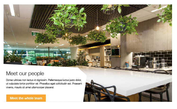
/* .pl-0 is bootstrap class that gives padding-left: 0; */<link href="https://maxcdn.bootstrapcdn.com/bootstrap/4.0.0/css/bootstrap.min.css" rel="stylesheet"/> <div class="container"> <div class="row"> <div class="col-mg-12"> <img src="http://placeimg.com/1000/480/any" /> </div> </div> </div> <div class="container"> <div class="row"> <div class="col-md-8 pl-0"> <div class="info-container"> <h2>Meet our team</h2> </div> <p> Donec ultrices non lectus id dignissim. Pellentesque luctus justo dolor, ut vulputate tortor porttitor vel. Phasellus eget sollicitudin est. Praesent viverra, </p> </div> </div> </div>
Advertisement
Answer
I have made you an example below using clip path. I personally would look to use an svg, due to browser support. See https://caniuse.com/#search=clip%20path Enjoy and let me know if you have any questions 🙂 I also threw in a couple other css tricks which I have used many times over the years.
body {
    margin: 0;
    padding: 0;
    box-sizing: border-box;
}

.hero-section {
    width: 100%;
    height: 100vh;
    min-height: 500px;
    background-image: url(http://placeimg.com/1000/480/any);
    background-repeat: no-repeat;
    background-position: center;
    background-size: cover;
    position: relative;
}

.shape-section {
    width: calc(100% - 5%);
    max-width: 500px;
    height: 40vh;
    min-height: 250px;
    background-color: white;
    position: absolute;
    bottom: 0;
    left: 0;
    clip-path: polygon(77% 5%, 100% 31%, 82% 100%, 0 100%, 0 0);
    display: flex;
    justify-content: center;
    align-items: center;
    flex-direction: column;
}

.title {
    margin-right: auto;
    max-width: 70%;
    margin-left: 24px;
}

.info {
    margin-right: auto;
    max-width: 70%;
    margin-left: 24px;
}

.cta-button {
    background-color: #FF5733;
    border-radius: 6px;
    border: 1px solid #900c3f;
    color: white;
    margin-right: auto;
    margin-left: 24px;
    transition: all .2s;
    box-shadow: 0 1px 3px rgba(0,0,0,0.2);
    font-size: 16px;
    padding: 8px 30px;
}

.cta-button:hover {
    box-shadow: 0 3px 6px rgba(0,0,0,0.3);
    transform: translateY(-2px);
    cursor: pointer;
}
<div class="hero-section">
<div class="shape-section">
<h1 class="title">Meet out People</h1>
<p class="info">Der dee herpderpsmer merp re herp derp derps. Ter mer merpus derp perp cerp le sherp? Ler se terp, mer nerpy.</p>
<button class="cta-button">Do Stuff</button>
</div>
</div>