
In the home page of my website there’s a Materialize carousel with 3 slides.
The page is a python flask template an the Materialize carousel is injected in the page, this is the base.html template
<!DOCTYPE html>
<html class="home-bkg">

<head>
    <!-- Global site tag (gtag.js) - Google Analytics -->
    <script async src="https://www.googletagmanager.com/gtag/js?id={{ga4MeasurementId}}"></script>
    <script>
        window.dataLayer = window.dataLayer || [];
        function gtag() { dataLayer.push(arguments); }
        gtag('js', new Date());

        gtag('config', '{{ga4MeasurementId}}');
    </script>

    {% block viewItemListAccessories %}{% endblock %}
    {% block viewItemListBags %}{% endblock %}
    {% block viewItemAccessory %}{% endblock %}
    {% block viewItemBag %}{% endblock %}

    <meta charset="utf-8" />

    {% block homeTitle %}{% endblock %}
    {% block bagsTitle %}{% endblock %}
    {% block accessoriesTitle %}{% endblock %}
    {% block reimaginedTitle %}{% endblock %}
    {% block makingOfTitle %}{% endblock %}
    {% block pressTitle %}{% endblock %}
    {% block bagTitle %}{% endblock %}
    {% block legalTitle %}{% endblock %}

    <!--Import Google Icon Font -->
    <link href="https://fonts.googleapis.com/icon?family=Material+Icons" rel="stylesheet">
    <!--Import Font awesome icons -->
    <link href="https://cdnjs.cloudflare.com/ajax/libs/font-awesome/4.7.0/css/font-awesome.min.css" rel="stylesheet" />
    <!--Import Google Font-->
    <link href="https://fonts.googleapis.com/css2?family=Arimo&family=Playfair+Display+Lato&display=swap"
        rel="stylesheet">
    <!--Import main.css and materialize.css-->
    <link type="text/css" rel="stylesheet" href="{{url_for('static', filename='css/main.css')}}" />
    <link type="text/css" rel="stylesheet" href="{{ url_for('static', filename='css/materialize.min.css')}}"
        media="screen,projection" />
    <!--Let browser know website is optimized for mobile-->
    <meta name="viewport" content="width=device-width, initial-scale=1.0" />
    <meta http-equiv="X-UA-Compatible" content="IE=edge" />

    {% block homeMeta %}{% endblock %}
    {% block accessoriesMeta %}{% endblock %}
    {% block reimaginedMeta %}{% endblock %}
    {% block bagMeta %}{% endblock %}
    {% block bagsMeta %}{% endblock %}
    {% block legalMeta %}{% endblock %}
    {% block makingOfMeta %}{% endblock %}
    {% block pressMeta %}{% endblock %}

    <link rel="shortcut icon" href="{{ url_for('static', filename='favicon.ico') }}">
</head>

<body>
    <div>
        <!-- header-menu -->
        <div class="row no-margin-bottom">
            <div class="header-menu valign-wrapper center-align">
                <div class="col l1"></div>
                <div class="col s12 m12 l3">
                    <!--main logo-->
                    <a href="/">
                        <img src="{{ url_for('static', filename='images/logo_black.png') }}" id="logo"
                            class="responsive-img" width="275" /></img>
                    </a>
                </div>
                <div class="col s12 m4 l2"><a id="bags" class="top-menu-item" href="/bags">BAGS</a></div>
                <div class="col s12 m4 l2"><a id="accessries" class="top-menu-item" href="/accessories">ACCESSORIES</a>
                </div>
                <div class="col s12 m4 l2"><a id="lostAndFound" class="top-menu-item" href="/reimagined">REIMAGINED</a>
                </div>
                <div class="col l1"></div>
            </div>
        </div>

        {% block home %}{% endblock %}
        {% block bags %}{% endblock %}
        {% block accessories %}{% endblock %}
        {% block reimagined %}{% endblock %}
        {% block makingOf %}{% endblock %}
        {% block press %}{% endblock %}
        {% block bag %}{% endblock %}
        {% block accessory %}{% endblock %}
        {% block legal %}{% endblock %}

        <!-- footer -->
        <div class="row">
            <div class="footer valign-wrapper center-align">
                <div class="col offset-s2 s8 offset-s2 m2 l1"><a id="imemoi" class="footer-item"
                        href="/imemoi">IMEMOI</a></div>
                <div class="col offset-s2 s8 offset-s2 m2 l1"><a id="press" class="footer-item" href="/press">PRESS</a>
                </div>
                <div class="col offset-s2 s8 offset-s2 m4 l4 social-icons fa-lg">
                    <ul>
                        <li id="fb-icon"><a href="http://www.facebook.com/pages/imemoi/137151246299509"
                                target="_blank"><i class="fa fa-facebook footer-item"></i></a></li>
                        <li id="is-icon"><a href="http://instagram.com/imemoi_paris" target="_blank"><i
                                    class="fa fa-instagram footer-item"></i></a></li>
                        <li id="pi-icon"><a href="http://pinterest.com/imemoi/" target="_blank"><i
                                    class="fa fa-pinterest footer-item"></i></a></li>
                    </ul>
                </div>
                <div class="col offset-s2 s8 offset-s2 m4 l3"><a id="making-of" class="footer-item"
                        href="/making-of">MAKING OF & ENGAGEMENT</a></div>
                <div class="col offset-s2 s8 offset-s2 offset-m4 m4 offset-m4 l1"><a id="legal" class="footer-item"
                        href="/legal">LEGAL</a></div>
                <div class="col offset-s2 s8 offset-s2 offset-m4 m4 offset-m4 l2"><a id="contact-us" class="footer-item"
                        href="/contactUs">CONTACT US</a></div>
            </div>
        </div>

        <div class="row">
            <div class="subscribe valign-wrapper center-align">
                <div class="input-field col s8 offset-m4 m4 offset-m4 offset-l4 l4 offset-l4">
                    <input id="subscriberEmail" type="email" class="validate"></input>
                    <label for="subscriberEmail">SUBSCRIBE</label>
                    <span class="promo">YOU'LL GET THE 15% OFF !!!</span>
                </div>
                <a id="subscriberBtn" class="waves-effect waves-light btn black"><i
                        class="material-icons right">send</i></a>
            </div>
        </div>

        <div class="footer-copyright">
            <div class="imemoi-copyright center-align">
                Powered By IMEMOI - © Copyright 2011-2020 - VAT IT02883161206</a>
            </div>
        </div>

    </div>
    <!--jQuery -->
    <script src="https://ajax.googleapis.com/ajax/libs/jquery/3.5.1/jquery.min.js"></script>
    <!--JavaScript -->
    <script type="text/javascript" src="{{url_for('static', filename='js/materialize.min.js')}}"></script>
    <script type="text/javascript" src="{{url_for('static', filename='js/main.js')}}"></script>
</body>

</html>
And this is the home.html template containing the carousel and the slides:
{% extends 'base.html' %}
{% block homeTitle %}
<title>imemoi: exclusive luxury bags | home</title>
{% endblock %}
{% block homeMeta %}
<meta name="description" content="happy few maximalist accessories & much more handmade in italy ★ 100% upcliclyng" />
<meta property="og:url" content="https://www.imemoi.com/" />
<meta property="og:image" content="https://www.imemoi.com/static/images/home_slide_3.jpg" />
<meta property="og:description" content="happy few maximalist accessories & much more handmade in italy ★ 100% upcliclyng" />
<meta property="og:type" content="website" />
{% endblock %}
{% block home %}
<div class="row">
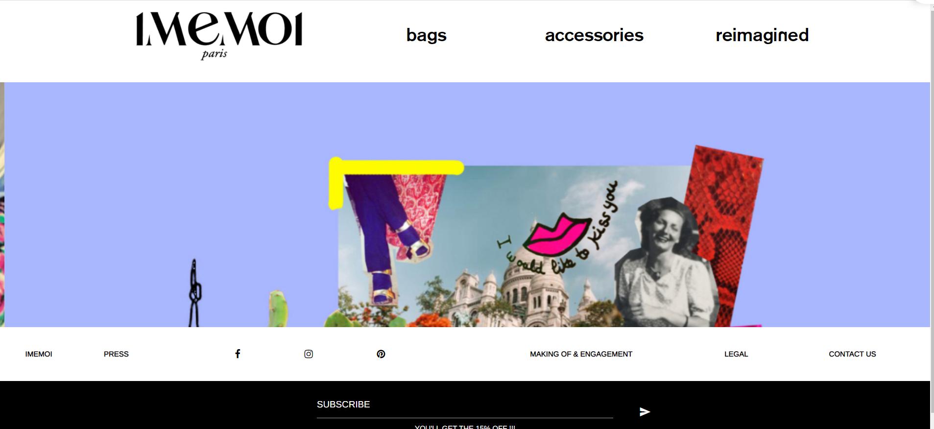
<div class="carousel carousel-slider">
<a class="carousel-item" href="https://www.imemoi.com/"><img src="static/images/home_slide_1.jpg" alt="First slide"></a>
<a class="carousel-item" href="https://www.imemoi.com/"><img src="static/images/home_slide_2.jpg" alt="Second slide"></a>
<a class="carousel-item" href="https://www.imemoi.com/"><img src="static/images/home_slide_3.jpg" alt="Third slide"></a>
</div>
</div>
{% endblock %}This is the Javascript that initialize the carousel:
$(document).ready(function () {


    $('.carousel.carousel-slider').carousel({fullWidth: true });
    window.setInterval(function () { $('.carousel').carousel('next') }, 4000);


});
The problem is this: when I load the page in the browser, the image is cutted and it remains cutted until I resize the screen, after resizing the screen the image dispays correctly:
I tried to solve the issue adding into the .css file this:
.slider{
    height: 770.987px;
}
but then I have problems with the mobile visualization: there’s empty space below the slide.
Last thig: images are all 3360 x 2240 pixels
I basically need to include the carousel in a way in which it will be visualized properly on laptop and mobile.
Advertisement
Answer
Basically the issue consists in the fact that the carousel is initialized before the images ar loaded and so the carousel height is not calculated properly. Initializing the carousel when all the page is loaded and not only the DOM will solve the issue:
$( window ).on( "load", function() {
    $('.carousel.carousel-slider').carousel({ fullWidth: true });
    window.setInterval(function () { $('.carousel').carousel('next') }, 4000);
 });