
The Code:
<html>
<style>
.img {
max-width: 100%;
}
.Headerstyle {
color: Black;
transition: transform .2s;
text-align: center;
margin-top: 39%;
}
.Headerstyle:hover {
transform: scale(1.5);
transition: 0.2s;
}
.HeaderstyleBack {
color: white;
transition: transform .2s;
text-align: center;
margin-top: 39%;
}
.HeaderstyleBack:hover {
transform: scale(1.5);
transition: 0.2s;
}
.image1 {
padding: 10px;
transition: transform .2s;
}
.image2 {
padding: 10px;
transition: transform .2s;
}
.image1:hover {
#border: 4px solid green;
#border-radius: 15px;
transform: scale(1.5);
transition: 0.2s;
}
.image2:hover {
#border: 4px solid green;
#border-radius: 15px;
transform: scale(1.5);
transition: 0.2s;
}
.imageback1 {
padding: 10px;
transition: transform .2s;
}
.imageback2 {
padding: 10px;
transition: transform .2s;
}
.imageback1:hover {
#border: 4px solid green;
#border-radius: 15px;
transform: scale(1.5);
transition: 0.2s;
}
.imageback2:hover {
#border: 4px solid green;
#border-radius: 15px;
transform: scale(1.5);
transition: 0.2s;
}
.footer {
position: relative;
left: 0;
bottom: 7%;
width: 100%;
background-color: ##0000ffff;
color: white;
text-align: center;
}
body {
border-style: solid;
border-width: 17px;
border-radius: 5px;
padding: 100px;
transition: 5s;
}
body {
margin: 0;
padding: 0;
animation: pulse 5s infinite;
}
.container {
width: 100%;
margin: 0px;
}
.Loading {
position: relative;
display: inline-block;
width: 100%;
height: 10%;
background: #f1f1f1;
box-shadow: inset 0 0 5px rgba(0, 0, 0, .2);
border-radius: 4px;
overflow: hidden;
margin-bottom: -50px;
}
.Loading:after {
content: '';
position: absolute;
background: blue;
width: 10%;
height: 100%;
border-radius: 2px;
box-shadow: 0 0 5px rgba(0, 0, 0, .2);
animation: load 5s infinite;
}
@keyframes load {
0% {
left: 0%;
}
25% {
width: 50%;
left: 50%
}
50% {
width: 10%;
left: 90%
}
75% {
width: 50%;
left: 0%
}
100% {
width: 10%;
left: 0%
}
}
@keyframes pulse {
0% {
border-color: gray;
}
25% {
border-color: gray;
}
50% {
border-color: gray;
}
75% {
border-color: #282828;
}
100% {
border-color: #282828;
}
}
.LoadingBack {
position: relative;
display: inline-block;
width: 100%;
height: 10%;
background: #000000;
box-shadow: inset 0 0 5px rgba(0, 0, 0, .2);
border-radius: 4px;
overflow: hidden;
margin-bottom: -50px;
}
.LoadingBack:after {
content: '';
position: absolute;
background: white;
width: 10%;
height: 100%;
border-radius: 2px;
box-shadow: 0 0 5px rgba(0, 0, 0, .2);
animation: load 5s infinite;
}
@keyframes load {
0% {
left: 0%;
}
25% {
width: 50%;
left: 50%
}
50% {
width: 10%;
left: 90%
}
75% {
width: 50%;
left: 0%
}
100% {
width: 10%;
left: 0%
}
}
@keyframes pulse {
0% {
border-color: #6699ff;
}
25% {
border-color: #ff6600;
}
50% {
border-color: #6699ff;
}
75% {
border-color: #ff6600;
}
100% {
border-color: #6699ff;
}
}
/* The flip card container - set the width and height to whatever you want. We have added the border property to demonstrate that the flip itself goes out of the box on hover (remove perspective if you don't want the 3D effect */
.flip-card {
background-color: transparent;
width: 100%;
height: 100%;
border: 1px solid #f1f1f1;
perspective: 1000px;
/* Remove this if you don't want the 3D effect */
}
/* This container is needed to position the front and back side */
.flip-card-inner {
position: relative;
width: 100%;
height: 100%;
text-align: center;
transition: transform 1.5s;
transform-style: preserve-3d;
}
/* Do an horizontal flip when you move the mouse over the flip box container */
.flip-card:active .flip-card-inner {
transform: rotateY(180deg);
}
/* Position the front and back side */
.flip-card-front,
.flip-card-back {
position: absolute;
width: 100%;
height: 100%;
-webkit-backface-visibility: hidden;
/* Safari */
backface-visibility: hidden;
}
/* Style the front side (fallback if image is missing) */
.flip-card-front {
background-color: #FFFDD0;
color: black;
}
/* Style the back side */
.flip-card-back {
# background-color: orange;
color: white;
font: 18px Arial, sans-serif;
background-image: url('https://c.tenor.com/YR9WPlpD1zEAAAAd/cloud.gif');
background-size: cover;
transform: rotateY(180deg);
}
//////////////////////////
*{
margin: 0px;
padding: 0px;
}
body{
font-family: Ariel, Helvetica, sans-serif;
background-color: #A3EBB1 ;
color: white;
line-height: 1.6;
text-align: center;
}
.container-welcome{
max-width: 960px;
margin: auto;
padding: 0 30px;
}
#showcase{
height: 300px;
}
#showcase h1{
font-size: 50px;
line-height: 1.3;
position: relative;
animation: heading;
animation-duration: 2.5s;
animation-fill-mode: forwards;
}
@keyframes heading{
0% {top: -50px;}
100% {top: 200px;}
}
#visual2 {
position: relative;
animation-name: visual;
animation-duration: 2s;
animation-fill-mode: forwards;
}
@keyframes visua2l{
0% {left: -1000px;}
100% {left: 0px;}
}
#visual {
position: relative;
animation: mymove 5s infinite;
}
@keyframes mymove {
50% {transform: rotate(45deg);}
}
.homepage {
display = 'none';
}
//////////////////////////
</style>
<script>
setTimeout(() => { const box = document.getElementById('showcase'); box.style.display = 'none';}, 2500);
setTimeout(() => { const box = document.getElementById('visual'); box.style.display = 'none';}, 2500);
setTimeout(() => { const box2 = document.getElementById('homepage'); box2.style.display = 'block';}, 2500);
</script>
<body>
<head>
<title>Dynamic Web Page</title>
</head>
<header id="showcase">
<h1>Uygulamaya Hoşgeldiniz</h1>
</header>
<div id="visual" class="container-welcome">
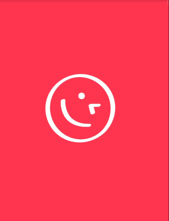
<img src="https://www.iconsdb.com/icons/preview/white/emoticon-30-xxl.png">
</div>
</div>
<div class="flip-card" id="homepage" style= "display:none;">
<div class="flip-card-inner">
<div class="flip-card-front">
<div class="footer" style="
display: flex;
flex-direction: column;
justify-content: space-between;
height: 100vh;">
<p class="Headerstyle"><b></b></p>
<div>
<div style="display: flex;justify-content: center;">
<a href="https://stackoverflow.com/"><img class="image1" src="https://cdn-icons-png.flaticon.com/128/2111/2111628.png" alt="stackoverflow icon" width="60" height="60"></a>
<a href="https://www.linkedin.com"><img class="image2" src="https://cdn-icons-png.flaticon.com/512/174/174857.png" alt="linkedin icon" width="60" height="60"></a>
</div>
<div class="container">
</div>
<div class="Loading"></div>
</div>
</div>
</div>
<div class="flip-card-back">
<div class="footer" style="
display: flex;
flex-direction: column;
justify-content: space-between;
height: 100vh;">
<p class="HeaderstyleBack"><b>tasci.murat06@gmail.com</b></p>
<div>
<div style="display: flex;justify-content: center;">
<a href="https://stackoverflow.com/"><img class="imageback1" src="https://cdn.iconscout.com/icon/free/png-64/stack-overflow-3770615-3147335.png" alt="stackoverflow icon" width="60" height="60"></a>
<a href="https://www.linkedin.com"><img class="imageback2" src="https://cdn.iconscout.com/icon/free/png-64/linkedin-104-436658.png" alt="linkedin icon" width="60" height="60"></a>
</div>
<div class="container">
</div>
<div class="LoadingBack"></div>
</div>
</div>
</div>
</div>
</body>
</html>
Hello friends,I have 2 questions. Firstly,How can I add a blink animation at the same angle after your smiley face turns a certain angle? In my code there is no blinking smiley feature. Finally, how do I make the page border not visible on the welcoming page? so mean I don’t want the border to appear on the welcoming screen. I have added Example images for this situation

Advertisement
Answer
I think this will help you. Add animation to your image and wait for finish animation(with delay function) then change the image with js.
function delay(time) {
  return new Promise(resolve => setTimeout(resolve, time));
}

function bodyOnload() {
  document.getElementById('animatedImg').style.WebkitTransitionDuration = '1s';
  document.getElementById('animatedImg').style.webkitTransform = 'rotate(45deg)';
  delay(900).then(() => {
    document.getElementById('animatedImg').src = "https://www.iconsdb.com/icons/preview/black/wink-xxl.png";
    /* if you don't want to rotate base delete this delay block*/
    delay(900).then(() => {
      document.getElementById('animatedImg').src = "https://www.iconsdb.com/icons/preview/white/emoticon-30-xxl.png";
      document.getElementById('animatedImg').style.WebkitTransitionDuration = '1s';
      document.getElementById('animatedImg').style.webkitTransform = 'rotate(0)';
    });
  });
}
body {
background-color: #A3EBB1;
color: white;
text-align: center;
}
.container-welcome {
max-width: 960px;
margin: auto;
padding: 0 30px;
}<body onload="bodyOnload()">
<div class="container-welcome">
<img id="animatedImg" src="https://www.iconsdb.com/icons/preview/white/emoticon-30-xxl.png">
</div>
</body>