
The Code:
<html>
<style>
  .img {
    max-width: 100%;
  }

  .Headerstyle {
    color: Black;
    transition: transform .2s;
    text-align: center;
    margin-top: 39%;
  }

  .Headerstyle:hover {
    transform: scale(1.5);
    transition: 0.2s;
  }

  .HeaderstyleBack {
    color: white;
    transition: transform .2s;
    text-align: center;
    margin-top: 39%;
  }

  .HeaderstyleBack:hover {
    transform: scale(1.5);
    transition: 0.2s;
  }

  .image1 {
    padding: 10px;
    transition: transform .2s;
  }

  .image2 {
    padding: 10px;
    transition: transform .2s;
  }

  .image1:hover {
    #border: 4px solid green;
    #border-radius: 15px;
    transform: scale(1.5);
    transition: 0.2s;
  }

  .image2:hover {
    #border: 4px solid green;
    #border-radius: 15px;
    transform: scale(1.5);
    transition: 0.2s;
  }

  .imageback1 {
    padding: 10px;
    transition: transform .2s;
  }

  .imageback2 {
    padding: 10px;
    transition: transform .2s;
  }

  .imageback1:hover {
    #border: 4px solid green;
    #border-radius: 15px;
    transform: scale(1.5);
    transition: 0.2s;
  }

  .imageback2:hover {
    #border: 4px solid green;
    #border-radius: 15px;
    transform: scale(1.5);
    transition: 0.2s;
  }

  .footer {
    position: relative;
    left: 0;
    bottom: 7%;
    width: 100%;
    background-color: ##0000ffff;
    color: white;
    text-align: center;
  }

  body {
    border-style: solid;
    border-width: 17px;
    border-radius: 5px;
    padding: 100px;
    transition: 5s;
  }

  body {
    margin: 0;
    padding: 0;
    animation: pulse 5s infinite;
  }

  .container {
    width: 100%;
    margin: 0px;
  }

  .Loading {
    position: relative;
    display: inline-block;
    width: 100%;
    height: 10%;
    background: #f1f1f1;
    box-shadow: inset 0 0 5px rgba(0, 0, 0, .2);
    border-radius: 4px;
    overflow: hidden;
    margin-bottom: -50px;
  }

  .Loading:after {
    content: '';
    position: absolute;
    background: blue;
    width: 10%;
    height: 100%;
    border-radius: 2px;
    box-shadow: 0 0 5px rgba(0, 0, 0, .2);
    animation: load 5s infinite;
  }

  @keyframes load {
    0% {
      left: 0%;
    }
    25% {
      width: 50%;
      left: 50%
    }
    50% {
      width: 10%;
      left: 90%
    }
    75% {
      width: 50%;
      left: 0%
    }
    100% {
      width: 10%;
      left: 0%
    }
  }

  @keyframes pulse {
    0% {
      border-color: gray;
    }
    25% {
      border-color: gray;
    }
    50% {
      border-color: gray;
    }
    75% {
      border-color: #282828;
    }
    100% {
      border-color: #282828;
    }
  }

  .LoadingBack {
    position: relative;
    display: inline-block;
    width: 100%;
    height: 10%;
    background: #000000;
    box-shadow: inset 0 0 5px rgba(0, 0, 0, .2);
    border-radius: 4px;
    overflow: hidden;
    margin-bottom: -50px;
  }

  .LoadingBack:after {
    content: '';
    position: absolute;
    background: white;
    width: 10%;
    height: 100%;
    border-radius: 2px;
    box-shadow: 0 0 5px rgba(0, 0, 0, .2);
    animation: load 5s infinite;
  }

  @keyframes load {
    0% {
      left: 0%;
    }
    25% {
      width: 50%;
      left: 50%
    }
    50% {
      width: 10%;
      left: 90%
    }
    75% {
      width: 50%;
      left: 0%
    }
    100% {
      width: 10%;
      left: 0%
    }
  }

  @keyframes pulse {
    0% {
      border-color: #6699ff;
    }
    25% {
      border-color: #ff6600;
    }
    50% {
      border-color: #6699ff;
    }
    75% {
      border-color: #ff6600;
    }
    100% {
      border-color: #6699ff;
    }
  }
  /* The flip card container - set the width and height to whatever you want. We have added the border property to demonstrate that the flip itself goes out of the box on hover (remove perspective if you don't want the 3D effect */

  .flip-card {
    background-color: transparent;
    width: 100%;
    height: 100%;
    border: 1px solid #f1f1f1;
    perspective: 1000px;
    /* Remove this if you don't want the 3D effect */
  }
  /* This container is needed to position the front and back side */

  .flip-card-inner {
    position: relative;
    width: 100%;
    height: 100%;
    text-align: center;
    transition: transform 1.5s;
    transform-style: preserve-3d;
  }
  /* Do an horizontal flip when you move the mouse over the flip box container */

  .flip-card:active .flip-card-inner {
    transform: rotateY(180deg);
  }
  /* Position the front and back side */

  .flip-card-front,
  .flip-card-back {
    position: absolute;
    width: 100%;
    height: 100%;
    -webkit-backface-visibility: hidden;
    /* Safari */
    backface-visibility: hidden;
  }
  /* Style the front side (fallback if image is missing) */

  .flip-card-front {
    background-color: #FFFDD0;
    color: black;
  }
  /* Style the back side */

  .flip-card-back {
   # background-color: orange;
    color: white;
    font: 18px Arial, sans-serif;
    background-image: url('https://c.tenor.com/YR9WPlpD1zEAAAAd/cloud.gif');
    background-size: cover;
    transform: rotateY(180deg);
  }


//////////////////////////
  *{
  margin: 0px;
  padding: 0px;
}

body{
  font-family: Ariel, Helvetica, sans-serif;
  background-color: #A3EBB1 ;

  color: white;
  line-height: 1.6;
  text-align: center;
}

.container-welcome{
  max-width: 960px;
  margin: auto;
  padding: 0 30px;
}

#showcase{
  height: 300px;
}

#showcase h1{
  font-size: 50px;
  line-height: 1.3;
  position: relative;
  animation: heading;
  animation-duration: 2.5s;
  animation-fill-mode: forwards;

}

@keyframes heading{
  0% {top: -50px;}
  100% {top: 200px;}
}

#visual2 {
  position: relative;
  animation-name: visual;
  animation-duration: 2s;
  animation-fill-mode: forwards;
}

@keyframes visua2l{
  0% {left: -1000px;}
  100% {left: 0px;}
}

#visual {

  position: relative;
  animation: mymove 5s infinite;
}

@keyframes mymove {
  50% {transform: rotate(45deg);}
}


.homepage {

  display = 'none';

}

//////////////////////////

</style>


<script>

function delay(time) {
  return new Promise(resolve => setTimeout(resolve, time));
}

function bodyOnload() {
  document.getElementById('animatedImg').style.WebkitTransitionDuration = '1s';
  document.getElementById('animatedImg').style.webkitTransform = 'rotate(45deg)';
  delay(900).then(() => {
    document.getElementById('animatedImg').src = "https://www.iconsdb.com/icons/preview/black/wink-xxl.png";
    /* if you don't want to rotate base delete this delay block*/
    delay(900).then(() => {
      document.getElementById('animatedImg').src = "https://www.iconsdb.com/icons/preview/white/emoticon-30-xxl.png";
      document.getElementById('animatedImg').style.WebkitTransitionDuration = '1s';
      document.getElementById('animatedImg').style.webkitTransform = 'rotate(0)';

         setTimeout(() => { const box = document.getElementById('animatedImg'); box.style.display = 'none';}, 2000);

         setTimeout(() => { const box = document.getElementById('showcase'); box.style.display = 'none';}, 2000);

         setTimeout(() => { const box2 = document.getElementById('homepage'); box2.style.display = 'block';}, 2000);
    });
  });
}

</script>


<body>


<head>
    <title>Dynamic Web Page</title>
</head>

<header id="showcase">
    <h1>Uygulamaya Hoşgeldiniz</h1>
</header>


<body onload="bodyOnload()">
  <div class="container-welcome">
    <img id="animatedImg" src="https://www.iconsdb.com/icons/preview/white/emoticon-30-xxl.png">
  </div>
</body>


  <div class="flip-card" id="homepage" style= "display:none;">
    <div class="flip-card-inner">
      <div class="flip-card-front">
        <div class="footer" style="
            display: flex;
            flex-direction: column;
            justify-content: space-between;
            height: 100vh;">
          <p class="Headerstyle"><b></b></p>
          <div>
            <div style="display: flex;justify-content: center;">

              <a href="https://stackoverflow.com/"><img class="image1" src="https://cdn-icons-png.flaticon.com/128/2111/2111628.png" alt="stackoverflow icon" width="60" height="60"></a>
              <a href="https://www.linkedin.com"><img class="image2" src="https://cdn-icons-png.flaticon.com/512/174/174857.png" alt="linkedin icon" width="60" height="60"></a>
            </div>
            <div class="container">
            </div>
            <div class="Loading"></div>
          </div>
        </div>

      </div>
      <div class="flip-card-back">
        <div class="footer" style="
            display: flex;
            flex-direction: column;
            justify-content: space-between;
            height: 100vh;">
          <p class="HeaderstyleBack"><b>tasci.murat06@gmail.com</b></p>
          <div>
            <div style="display: flex;justify-content: center;">

              <a href="https://stackoverflow.com/"><img class="imageback1" src="https://cdn.iconscout.com/icon/free/png-64/stack-overflow-3770615-3147335.png" alt="stackoverflow icon" width="60" height="60"></a>
              <a href="https://www.linkedin.com"><img class="imageback2" src="https://cdn.iconscout.com/icon/free/png-64/linkedin-104-436658.png" alt="linkedin icon" width="60" height="60"></a>
            </div>
            <div class="container">
            </div>
            <div class="LoadingBack"></div>
          </div>
        </div>
      </div>
    </div>


</body>


</html>
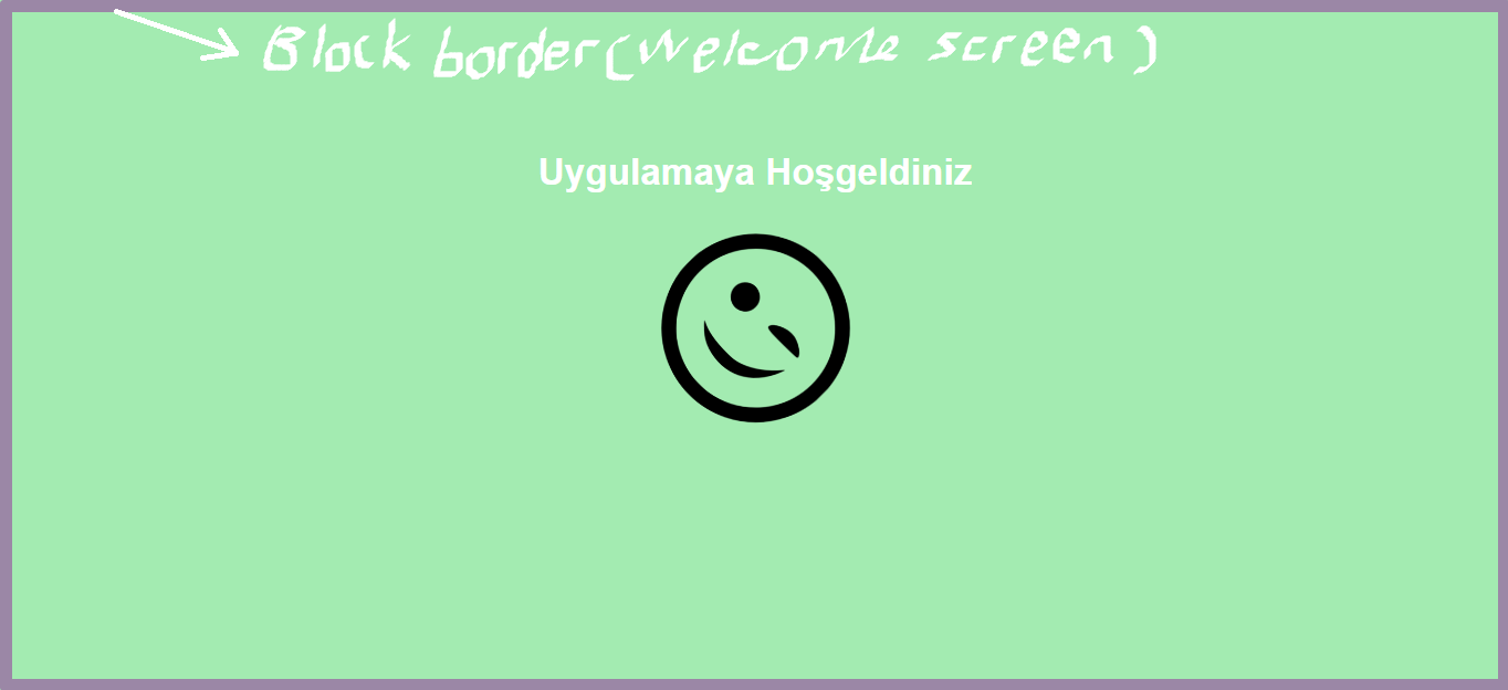
Hello friends, How can I prevent the border from appearing when the welcome screen appears?
That means I want to see a border on the only main page. How can fix this on my code? I couldn’t block the border during the welcome screen. I also added a picture of the desired situation. You can see it below. I am waiting for your help.
Advertisement
Answer
First define an id to body element, then write document.getelementbyID("definedID").style.border="solid 50px"; in your function(bodyOnLoad()). Therefore you have a animated border that scaling 0px to 50px on body.
You can use the code below: (in chrome, it will work more accurately than the snippet)
<html>
<style>
  .img {
    max-width: 100%;
  }

  .Headerstyle {
    color: Black;
    transition: transform .2s;
    text-align: center;
    margin-top: 39%;
  }

  .Headerstyle:hover {
    transform: scale(1.5);
    transition: 0.2s;
  }

  .HeaderstyleBack {
    color: white;
    transition: transform .2s;
    text-align: center;
    margin-top: 39%;
  }

  .HeaderstyleBack:hover {
    transform: scale(1.5);
    transition: 0.2s;
  }

  .image1 {
    padding: 10px;
    transition: transform .2s;
  }

  .image2 {
    padding: 10px;
    transition: transform .2s;
  }

  .image1:hover {
    #border: 4px solid green;
    #border-radius: 15px;
    transform: scale(1.5);
    transition: 0.2s;
  }

  .image2:hover {
    #border: 4px solid green;
    #border-radius: 15px;
    transform: scale(1.5);
    transition: 0.2s;
  }

  .imageback1 {
    padding: 10px;
    transition: transform .2s;
  }

  .imageback2 {
    padding: 10px;
    transition: transform .2s;
  }

  .imageback1:hover {
    #border: 4px solid green;
    #border-radius: 15px;
    transform: scale(1.5);
    transition: 0.2s;
  }

  .imageback2:hover {
    #border: 4px solid green;
    #border-radius: 15px;
    transform: scale(1.5);
    transition: 0.2s;
  }

  .footer {
    position: relative;
    left: 0;
    bottom: 7%;
    width: 100%;
    background-color: ##0000ffff;
    color: white;
    text-align: center;
  }

  .all {
    display:block;
    border-style: none;
    border-width: 0 px;
    border-radius: 5px;
    padding: 100px;
    transition: 5s;
  }

  .all {
    margin: 0;
    padding: 0;
    animation: pulse 5s infinite;
  }

  .container {
    width: 100%;
    margin: 0px;
  }

  .Loading {
    position: relative;
    display: inline-block;
    width: 100%;
    height: 10%;
    background: #f1f1f1;
    box-shadow: inset 0 0 5px rgba(0, 0, 0, .2);
    border-radius: 4px;
    overflow: hidden;
    margin-bottom: -50px;
  }

  .Loading:after {
    content: '';
    position: absolute;
    background: blue;
    width: 10%;
    height: 100%;
    border-radius: 2px;
    box-shadow: 0 0 5px rgba(0, 0, 0, .2);
    animation: load 5s infinite;
  }

  @keyframes load {
    0% {
      left: 0%;
    }
    25% {
      width: 50%;
      left: 50%
    }
    50% {
      width: 10%;
      left: 90%
    }
    75% {
      width: 50%;
      left: 0%
    }
    100% {
      width: 10%;
      left: 0%
    }
  }

  @keyframes pulse {
    0% {
      border-color: gray;
    }
    25% {
      border-color: gray;
    }
    50% {
      border-color: gray;
    }
    75% {
      border-color: #282828;
    }
    100% {
      border-color: #282828;
    }
  }

  .LoadingBack {
    position: relative;
    display: inline-block;
    width: 100%;
    height: 10%;
    background: #000000;
    box-shadow: inset 0 0 5px rgba(0, 0, 0, .2);
    border-radius: 4px;
    overflow: hidden;
    margin-bottom: -50px;
  }

  .LoadingBack:after {
    content: '';
    position: absolute;
    background: white;
    width: 10%;
    height: 100%;
    border-radius: 2px;
    box-shadow: 0 0 5px rgba(0, 0, 0, .2);
    animation: load 5s infinite;
  }

  @keyframes load {
    0% {
      left: 0%;
    }
    25% {
      width: 50%;
      left: 50%
    }
    50% {
      width: 10%;
      left: 90%
    }
    75% {
      width: 50%;
      left: 0%
    }
    100% {
      width: 10%;
      left: 0%
    }
  }

  @keyframes pulse {
    0% {
      border-color: #6699ff;
    }
    25% {
      border-color: #ff6600;
    }
    50% {
      border-color: #6699ff;
    }
    75% {
      border-color: #ff6600;
    }
    100% {
      border-color: #6699ff;
    }
  }
  /* The flip card container - set the width and height to whatever you want. We have added the border property to demonstrate that the flip itself goes out of the box on hover (remove perspective if you don't want the 3D effect */

  .flip-card {
    background-color: transparent;
    width: 100%;
    height: 100%;
    border: 1px solid #f1f1f1;
    perspective: 1000px;
    /* Remove this if you don't want the 3D effect */
  }
  /* This container is needed to position the front and back side */

  .flip-card-inner {
    position: relative;
    width: 100%;
    height: 100%;
    text-align: center;
    transition: transform 1.5s;
    transform-style: preserve-3d;
  }
  /* Do an horizontal flip when you move the mouse over the flip box container */

  .flip-card:active .flip-card-inner {
    transform: rotateY(180deg);
  }
  /* Position the front and back side */

  .flip-card-front,
  .flip-card-back {
    position: absolute;
    width: 100%;
    height: 100%;
    -webkit-backface-visibility: hidden;
    /* Safari */
    backface-visibility: hidden;
  }
  /* Style the front side (fallback if image is missing) */

  .flip-card-front {
    background-color: #FFFDD0;
    color: black;
  }
  /* Style the back side */

  .flip-card-back {
   # background-color: orange;
    color: white;
    font: 18px Arial, sans-serif;
    background-image: url('https://c.tenor.com/YR9WPlpD1zEAAAAd/cloud.gif');
    background-size: cover;
    transform: rotateY(180deg);
  }


  *{
  margin: 0px;
  padding: 0px;
}


body{
  font-family: Ariel, Helvetica, sans-serif;
  background-color: #A3EBB1 ;

  color: white;
  line-height: 1.6;
  text-align: center;
}

.container-welcome{
  max-width: 960px;
  margin: auto;
  padding: 0 30px;
}

#showcase{
  height: 300px;
}

#showcase h1{
  font-size: 50px;
  line-height: 1.3;
  position: relative;
  animation: heading;
  animation-duration: 2.5s;
  animation-fill-mode: forwards;

}

@keyframes heading{
  0% {top: -50px;}
  100% {top: 200px;}
}

#visual2 {
  position: relative;
  animation-name: visual;
  animation-duration: 2s;
  animation-fill-mode: forwards;
}

@keyframes visua2l{
  0% {left: -1000px;}
  100% {left: 0px;}
}

#visual {

  position: relative;
  animation: mymove 5s infinite;
}

@keyframes mymove {
  50% {transform: rotate(45deg);}
}


</style>


<script>

function delay(time) {
  return new Promise(resolve => setTimeout(resolve, time));
}

function bodyOnload() {
  document.getElementById('animatedImg').style.WebkitTransitionDuration = '1s';
  document.getElementById('animatedImg').style.webkitTransform = 'rotate(45deg)';
  delay(900).then(() => {
    document.getElementById('animatedImg').src = "https://www.iconsdb.com/icons/preview/black/wink-xxl.png";
    /* if you don't want to rotate base delete this delay block*/
    delay(900).then(() => {
      document.getElementById('animatedImg').src = "https://www.iconsdb.com/icons/preview/white/emoticon-30-xxl.png";
      document.getElementById('animatedImg').style.WebkitTransitionDuration = '1s';
      document.getElementById('animatedImg').style.webkitTransform = 'rotate(0)';

         setTimeout(() => { const box = document.getElementById('animatedImg'); box.style.display = 'none';}, 2000);

         setTimeout(() => { const box = document.getElementById('showcase'); box.style.display = 'none';}, 2000);

         setTimeout(() => { const box2 = document.getElementById('homepage'); box2.style.display = 'block';}, 2000);
        document.getElementById('innerbody').style.border="solid 70px";
    });
  });
}


</script>


<body>


<head>
    <title>Dynamic Web Page</title>
</head>

<header id="showcase">
    <h1>Uygulamaya Hoşgeldiniz</h1>
</header>


<body onload="bodyOnload()">
  <div class="container-welcome">
    <img id="animatedImg" src="https://www.iconsdb.com/icons/preview/white/emoticon-30-xxl.png">
  </div>
</body>

<body id="innerbody" class="all">


  <div class="flip-card" id="homepage" style= "display:none;">
    <div class="flip-card-inner">
      <div class="flip-card-front">
        <div class="footer" style="
            display: flex;
            flex-direction: column;
            justify-content: space-between;
            height: 100vh;">
          <p class="Headerstyle"><b></b></p>
          <div>
            <div style="display: flex;justify-content: center;">

              <a href="https://stackoverflow.com/"><img class="image1" src="https://cdn-icons-png.flaticon.com/128/2111/2111628.png" alt="stackoverflow icon" width="60" height="60"></a>
              <a href="https://www.linkedin.com"><img class="image2" src="https://cdn-icons-png.flaticon.com/512/174/174857.png" alt="linkedin icon" width="60" height="60"></a>
            </div>
            <div class="container">
            </div>
            <div class="Loading"></div>
          </div>
        </div>

      </div>
      <div class="flip-card-back">
        <div class="footer" style="
            display: flex;
            flex-direction: column;
            justify-content: space-between;
            height: 100vh;">
          <p class="HeaderstyleBack"><b>tasci.murat06@gmail.com</b></p>
          <div>
            <div style="display: flex;justify-content: center;">

              <a href="https://stackoverflow.com/"><img class="imageback1" src="https://cdn.iconscout.com/icon/free/png-64/stack-overflow-3770615-3147335.png" alt="stackoverflow icon" width="60" height="60"></a>
              <a href="https://www.linkedin.com"><img class="imageback2" src="https://cdn.iconscout.com/icon/free/png-64/linkedin-104-436658.png" alt="linkedin icon" width="60" height="60"></a>
            </div>
            <div class="container">
            </div>
            <div class="LoadingBack"></div>
          </div>
        </div>
      </div>
    </div>

<body>

</body>

<script type="text/javascript">

    </script>
</html>