
We have Vue.js app that uses Quasar component framework.
The screen shots look as following:
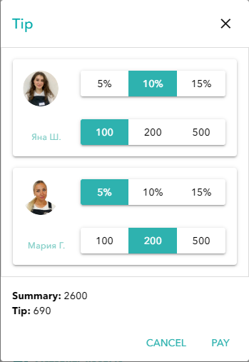
Incorrect case:
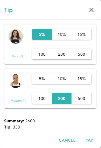
Correct case:
I need the only one toggle button group should be active, either percents or standard amounts. Pay attention there’s an array of toggle button groups.
The code I wrote produces the incorrect case. It looks as following:
<template>
  <q-dialog v-model="show" no-backdrop-dismiss full-width>
    <q-card>
      <q-card-section class="row items-center">
        <div class="text-h6 tip-color">Tip</div>
        <q-space />
        <q-btn icon="close" flat round dense v-close-popup @click="cancel" />
      </q-card-section>
      <q-card-section style="max-height: 50vh" class="scroll set-border">
        <div class="q-gutter-md">
          <q-card v-for="({ master }, index) in items" :key="master.id">
            <div class="row">
              <div class="col-3 flex justify-center items-center">
                <Avatar
                  :src="master.employer_avatar"
                  :size="50"
                  no-default-spinner
                />
                <span class="q-ml-md text-caption text-secondary">
                  {{ getEmployerName(master) }}
                </span>
              </div>
              <div class="col">
                <q-card-section>
                  <q-btn-toggle
                    v-model="togglePercentPayments[index]"
                    toggle-color="primary"
                    :options="percentPayments"
                    spread
                    @input="getFullTip"
                  />
                </q-card-section>
                <q-card-section>
                  <q-btn-toggle
                    v-model="toggleStandardPayments[index]"
                    toggle-color="primary"
                    :options="standardPayments"
                    spread
                    @input="getFullTip"
                  />
                </q-card-section>
              </div>
            </div>
          </q-card>
        </div>
      </q-card-section>
      <q-card-section>
        <div><strong>Summary:</strong> {{ total }}</div>
        <div>
          <strong>Tip:</strong> {{ getFullTip() ? getFullTip() : 0 }}
        </div>
      </q-card-section>
      <q-card-actions align="right" class="text-primary q-pt-none">
        <q-btn flat label="Cancel" @click="cancel" />
        <q-btn flat label="Pay" @click="pay" />
      </q-card-actions>
    </q-card>
  </q-dialog>
</template>

<script>
const percentPayments = [
  { label: '5%', value: 5 },
  { label: '10%', value: 10 },
  { label: '15%', value: 15 },
]

const standardPayments = [
  { label: '100', value: 100 },
  { label: '200', value: 200 },
  { label: '500', value: 500 },
]

export default {
  props: {
    showModal: {
      type: Boolean,
      default: false,
    },
    items: {
      type: Array,
      default: () => [],
    },
    total: {
      type: Number,
      default: 0,
    },
  },
  data: function() {
    return {
      show: false,
      togglePercentPayments: new Array(this.items.length).fill(null),
      toggleStandardPayments: new Array(this.items.length).fill(null),
      percentPayments,
      standardPayments,
    }
  },
  watch: {
    showModal(newVal) {
      this.show = newVal
    },
  },
  methods: {
    getEmployerName(master) {
      return `${master?.first_name ?? ''} ${master?.last_name[0] ?? ''}.`
    },
    getPercentage(total, percent) {
      return (total / 100) * percent
    },
    getFullTip() {
      let standardSum = 0
      for (const standardPayment of this.toggleStandardPayments) {
        standardSum += standardPayment
      }

      let percentageSum = 0
      for (const percentagePayment of this.togglePercentPayments) {
        const percent = this.getPercentage(this.total, percentagePayment)
        percentageSum += percent
      }

      return standardSum + percentageSum
    },
    pay() {
      this.$emit('pay', this.getFullTip())
      this.clear()
    },
    cancel() {
      this.$emit('cancel')
      this.clear()
    },
    clear() {
      this.togglePercentPayments = new Array(this.items.length).fill(null)
      this.toggleStandardPayments = new Array(this.items.length).fill(null)
    },
  },
}
</script>

<style scoped>
.set-border {
  border: 1px solid gainsboro;
}
.tip-color {
  color: rgb(4, 171, 171);
}
</style>
How to make 2 Quasar toggle button groups mutually exclusive?
Advertisement
Answer
Here’s the solution if anyone needs. The guys from Quasar tech support helped me.
<template>
  <q-dialog v-model="show" no-backdrop-dismiss full-width>
    <q-card>
      <q-card-section class="row items-center">
        <div class="text-h6 tip-color">Tip</div>
        <q-space />
        <q-btn icon="close" flat round dense v-close-popup @click="cancel" />
      </q-card-section>
      <q-card-section style="max-height: 50vh" class="scroll set-border">
        <div class="q-gutter-md">
          <q-card v-for="({ master }, index) in items" :key="master.id">
            <div class="row">
              <div class="col-3 flex justify-center items-center">
                <Avatar
                  :src="master.employer_avatar"
                  :size="50"
                  no-default-spinner
                />
                <span class="q-ml-md text-caption text-secondary">
                  {{ getEmployerName(master) }}
                </span>
              </div>
              <div class="col">
                <q-card-section>
                  <q-btn-toggle
                    v-model="togglePayments[index]"
                    toggle-color="primary"
                    :options="percentPayments"
                    spread
                    @input="getTotalTip"
                  />
                </q-card-section>
                <q-card-section>
                  <q-btn-toggle
                    v-model="togglePayments[index]"
                    toggle-color="primary"
                    :options="standardPayments"
                    spread
                    @input="getTotalTip"
                  />
                </q-card-section>
              </div>
            </div>
          </q-card>
        </div>
      </q-card-section>
      <q-card-section>
        <div><strong>Summary:</strong> {{ total }}</div>
        <div>
          <strong>Tip:</strong> {{ getTotalTip() ? getTotalTip() : 0 }}
        </div>
      </q-card-section>
      <q-card-actions align="right" class="text-primary q-pt-none">
        <q-btn flat label="Cancel" @click="cancel" />
        <q-btn flat label="Pay" @click="pay" />
      </q-card-actions>
    </q-card>
  </q-dialog>
</template>

<script>
import { axiosInstance } from 'src/boot/axios'
import { api } from 'src/api'

const percentPayments = [
  { label: '5%', value: 0.05 },
  { label: '10%', value: 0.1 },
  { label: '15%', value: 0.2 },
]

const standardPayments = [
  { label: '100', value: 100 },
  { label: '200', value: 200 },
  { label: '500', value: 500 },
]

export default {
  props: {
    showModal: {
      type: Boolean,
      default: false,
    },
    items: {
      type: Array,
      default: () => [],
    },
    total: {
      type: Number,
      default: 0,
    },
    orderId: {
      type: Number,
      required: true,
    },
  },
  data: function() {
    return {
      show: false,
      togglePayments: new Array(this.items.length).fill(0.0),
      percentPayments,
      standardPayments,
    }
  },
  watch: {
    showModal(newVal) {
      this.show = newVal
    },
  },
  methods: {
    getEmployerName(master) {
      return `${master?.first_name ?? ''} ${master?.last_name[0] ?? ''}.`
    },
    getValue(value, amount) {
      const floatValue = Number.parseFloat(value)
      if (floatValue > 1) {
        return floatValue
      }
      return floatValue * amount
    },
    getTotalTip() {
      let totalTip = 0
      for (const tip of this.togglePayments) {
        totalTip += this.getValue(tip, this.total)
      }

      return totalTip
    },
    async pay() {
      try {
        const response = await axiosInstance.post(api.payments.all, {
          reason_type: 'order',
          reason_id: this.orderId,
          amount: this.total + this.getTotalTip(),
        })
        this.$store.commit('booking/setCreatedPayment', response.data.data)
        this.$router.push({ name: 'Payment' })
      } catch (e) {
        console.info(e)
      }
    },
    cancel() {
      this.$emit('cancel')
      this.clear()
    },
    clear() {
      this.togglePercentPayments = new Array(this.items.length).fill(0.0)
      this.toggleStandardPayments = new Array(this.items.length).fill(0.0)
    },
  },
}
</script>

<style scoped>
.set-border {
  border: 1px solid gainsboro;
}
.tip-color {
  color: rgb(4, 171, 171);
}
</style>