
Im trying to make a hamburger icon turn into an x on click and then revert when clicking again. Ive got the animation set up i think but i need it to trigger on click rather than be constantley set.
.nav-toggle {
  position: absolute;
  top: 2.3rem;
  right: 1rem;
  display: none;
  flex-direction: column;
  justify-content: space-between;
  height: 22px;
  width: 22px;
}

.nav-toggle:hover { /
  cursor: pointer;
}

.nav-toggle .bar {
  height: 3px;
  width: 100%;
  background-color: white;
  border-radius: 10px;

}

.nav-toggle .bar:nth-child(2) {
  transform: translateX(-50px);
  background: transparent;
  box-shadow: none;
}

.nav-toggle .bar:nth-child(1) {
  transform: rotate(45deg) translatey(13px)
}

.nav-toggle .bar:nth-child(3) {
  transform: rotate(-45deg) translateY(-13px)
}

.nav-toggle:active {
  transition: 1s;
}
The ToggleNavLinks function is only used set an elements display to none unrelated to the hamburger icon.
<a class="nav-toggle" onclick="ToggleNavLinks()" >
    <span class="bar"></span>
    <span class="bar"></span>
    <span class="bar"></span>
</a>
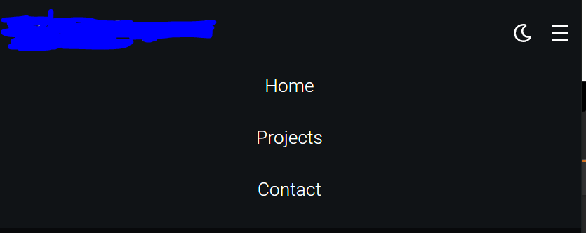
Menu opening image reference:
script.js
function ToggleNavLinks() {
    var navLink = document.getElementsByClassName("nav-links")[0];
    var navBar = document.getElementsByClassName("navbar")[0];

    if (window.getComputedStyle(navLink).display === "none") {
        navLink.style.display = "flex";
        navBar.style.background = "#181a1d";
    }
    else {
        navLink.style.display = "none";
        navBar.style.background = "none";
    }
}
Advertisement
Answer
You can use tranform: rotate() on the top and bottom with a transition on the width for the middle span.
let navToggle = document.querySelector('.nav-toggle')
let bars = document.querySelectorAll('.bar')

function toggleHamburger(e) {
  bars.forEach(bar => bar.classList.toggle('x'))
}

navToggle.addEventListener('click', toggleHamburger)
.nav-toggle {
display: flex;
flex-direction: column;
justify-content: space-between;
height: 22px;
width: 22px;
}
.nav-toggle .bar {
height: 3px;
width: 100%;
background-color: black;
transition: all 100ms ease-in-out;
}
.nav-toggle:hover {
cursor: pointer;
}
.x:nth-of-type(1) {
transition: all 100ms ease-in-out;
transform: rotate(45deg);
transform-origin: top left;
width: 28px;
}
.x:nth-of-type(2) {
transition: all 100ms ease-in-out;
transform-origin: center;
width: 0;
}
.x:nth-of-type(3) {
transition: all 100ms ease-in-out;
transform: rotate(-45deg);
transform-origin: bottom left;
width: 28px;
}<a class="nav-toggle"> <span class="bar"></span> <span class="bar"></span> <span class="bar"></span> </a>