
I’m losing my head over this modal which keeps showing up inside my side div area, I haven’t found anything about it on the bootstrp5 documentation nor on any online forums.
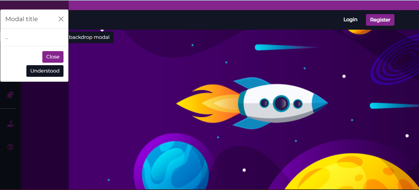
I just need it to render centered on the page, and the fade effect to affect all background, as per the bootstrap documentation (https://getbootstrap.com/docs/5.0/components/modal/). But I haven’t found any way to make it work…
I’m using bootstrap 5 (custom.css) with the following frontend code:
HTML:
<!DOCTYPE html>
<html lang="en">

<head>
    <meta charset="UTF-8" />
    <meta name="viewport" content="width=device-width, initial-scale=1.0" />
    <meta http-equiv="X-UA-Compatible" content="ie=edge" />

    <link href="./css/custom.css" rel="stylesheet">
    <link href="./css/navlayout.css" rel="stylesheet">
    <link href="https://cdn.jsdelivr.net/npm/boxicons@latest/css/boxicons.min.css" rel="stylesheet">

    <script defer src="https://cdn.jsdelivr.net/npm/bootstrap@5.0.2/dist/js/bootstrap.bundle.min.js" integrity="sha384-MrcW6ZMFYlzcLA8Nl+NtUVF0sA7MsXsP1UyJoMp4YLEuNSfAP+JcXn/tWtIaxVXM" crossorigin="anonymous"></script>
    <script defer src="./js/navlayout.js"></script>
    <script defer src="https://cdnjs.cloudflare.com/ajax/libs/font-awesome/5.15.3/js/all.min.js" crossorigin="anonymous"></script>

    <link rel="icon" href="./img/icon.png" />

    <title>Basic - Bootstrap 5 with Gulp 4</title>
</head>

<body id="body-pd" style="background: url('./img/Home e Roleta.png') no-repeat center center fixed; background-size: cover;">
    <header class="top-header align-middle">
        <div class="mx-auto"></div>
    </header>
    <header class="header" id="header">
        <div class="header_toggle" id="toggle-up"> <i class="fas fa-bars secondary-bs-color" id="header-toggle"></i></div>

        <div class="me-5">
            <a class=" white-bs-colorbtn btn-secondary-outline me-4" href="#" role="button" style="color: white; font-weight: bold;">Login</a>
            <a class="white-bs-color btn btn-secondary" href="#" role="button" style="color: white; font-weight: bold">Register</a>
        </div>
    </header>
    <div class="l-navbar" id="nav-bar">
        <nav class="nav">
            <div>
                <div class="nav_list">
                    <!-- <a href="#" class="nav_logo"> <img src="./img/Logo Vegaz Bet MOEDA.png" width="30px" alt="" /> <span class="nav_logo-name"><img src="./img/Logo Vegaz Bet ESCRITA.png" width="100px" alt=""/></span> </a> -->
                    <a href="#" class="nav_link active"> <i class="fas fa-chart-line nav_icon secondary-bs-color"></i> <span class="nav_name">Crash</span> </a>
                    <a href="#" class="nav_link"> <i class="far fa-life-ring nav_icon secondary-bs-color"></i> <span class="nav_name">Roullete</span> </a>
                    <a href="#" class="nav_link"> <i class="fas fa-dice nav_icon secondary-bs-color"></i> <span class="nav_name">Dice</span> </a>
                    <a href="#" class="nav_link"> <i class="fas fa-coins nav_icon secondary-bs-color"></i> <span class="nav_name">Heads or Tails</span> </a>
                    <hr class="bg-white border-2 border-top border-white">
                    <a href="#" class="nav_link"> <i class="fas fa-hand-holding-usd nav_icon secondary-bs-color"></i> <span class="nav_name">Deposit /<br> Withdrawal</span> </a>
                    <a href="#" class="nav_link"> <i class="far fa-question-circle nav_icon secondary-bs-color"></i> <span class="nav_name">Help</span> </a>
                </div>
            </div>

        </nav>
    </div>
    <!--Container Main start-->
    <div class="height-100">
        <h4>Main Components</h4>
        <button type="button" class="btn btn-primary" data-bs-toggle="modal" data-bs-target="#staticBackdrop">
            Launch static backdrop modal
        </button>
        <!-- Login modal -->
        <div class="modal fade" id="staticBackdrop" data-bs-backdrop="static" data-bs-keyboard="false" tabindex="-1" aria-labelledby="staticBackdropLabel" aria-hidden="true">
            <div class="modal-dialog">
            <div class="modal-content">
                <div class="modal-header">
                <h5 class="modal-title" id="staticBackdropLabel">Modal title</h5>
                <button type="button" class="btn-close" data-bs-dismiss="modal" aria-label="Close"></button>
                </div>
                <div class="modal-body">
                ...
                </div>
                <div class="modal-footer">
                <button type="button" class="btn btn-secondary" data-bs-dismiss="modal">Close</button>
                <button type="button" class="btn btn-primary">Understood</button>
                </div>
            </div>
            </div>
        </div>

        <!-- Registration modal -->
    </div>
    <!--Container Main end-->

</body>

</html>
Navlayout CSS:
@import url("https://fonts.googleapis.com/css2?family=Montserrat&display=swap");
:root {
    --top-header-top-position: 5%;
    --header-height: 3rem;
    --nav-width: 68px;
    --primary-color: var(--bs-primary);
    --secondary-color: var(--bs-secondary);
    --white-color: #FFFFFF;
    --body-font: 'Montserrat', sans-serif;
    --normal-font-size: 1rem;
    --z-fixed: 100;
    --z-topbar: 101;
}

*,
::before,
::after {
    box-sizing: border-box
}

body {
    position: relative;
    margin: var(--header-height) 0 0 0;
    padding: 0 1rem;
    font-family: var(--body-font);
    font-size: var(--normal-font-size);
    transition: .5s;
    -webkit-background-size: cover;
    -moz-background-size: cover;
    background-size: cover;
    -o-background-size: cover;
}

a {
    text-decoration: none
}

.top-header {
    width: 100%;
    height: var(--top-header-top-position);
    position: fixed;
    top: 0;
    left: 0;
    display: flex;
    align-items: center;
    justify-content: space-between;
    padding: 0 1rem;
    background-color: var(--secondary-color);
    z-index: var(--z-topbar);
    transition: .5s;
    text-align: center !important;
}

.header {
    width: 100%;
    height: var(--header-height);
    position: fixed;
    top: var(--top-header-top-position);
    left: 0;
    display: flex;
    align-items: center;
    justify-content: space-between;
    padding: 0 1rem;
    background-color: var(--primary-color);
    z-index: var(--z-fixed);
    transition: .5s
}

.header_toggle {
    color: var(--primary-color);
    font-size: 1.5rem;
    cursor: pointer
}

.header_img {
    width: 35px;
    height: 35px;
    display: flex;
    justify-content: center;
    border-radius: 50%;
    overflow: hidden
}

.header_img img {
    width: 40px
}

.l-navbar {
    position: fixed;
    top: 0;
    left: -30%;
    width: var(--nav-width);
    height: 100vh;
    background-color: var(--primary-color);
    padding: .5rem 1rem 0 0;
    transition: .5s;
    z-index: var(--z-fixed)
}

.nav {
    height: 100%;
    display: flex;
    flex-direction: column;
    justify-content: space-between;
    overflow: hidden;
    margin-top: 5rem;
}

.nav_logo,
.nav_link {
    display: grid;
    grid-template-columns: max-content max-content;
    align-items: center;
    column-gap: 1rem;
    padding: .5rem 0 .5rem 1.5rem
}

.nav_logo {
    margin-bottom: 2rem
}

.nav_logo-icon {
    font-size: 1.25rem;
    color: var(--white-color)
}

.nav_logo-name {
    color: var(--white-color);
    font-weight: 700
}

.nav_link {
    position: relative;
    color: var(--white-color);
    margin-bottom: 1.5rem;
    transition: .3s
}

.nav_link:hover {
    color: var(--white-color)
}

.nav_icon {
    font-size: 1.25rem;
}

.secondary-bs-color {
    color: var(--bs-secondary)
}

.white-bs-color {
    color: var(--white-colo)
}

.show {
    left: 0
}

.body-pd {
    padding-left: calc(var(--nav-width) + 1rem)
}

.active {
    color: var(--white-color)
}

.active::before {
    content: '';
    position: absolute;
    left: 0;
    width: 2px;
    height: 32px;
    background-color: var(--white-color)
}

.height-100 {
    height: 100vh
}

@media screen and (min-width: 768px) {
    body {
        margin: calc(var(--header-height) + 1rem) 0 0 0;
        padding-left: calc(var(--nav-width) + 2rem)
    }
    .header {
        height: calc(var(--header-height) + 1rem);
        padding: 0 2rem 0 calc(var(--nav-width) + 2rem)
    }
    .header_img {
        width: 40px;
        height: 40px
    }
    .header_img img {
        width: 45px
    }
    .l-navbar {
        left: 0;
        padding: 1rem 1rem 0 0
    }
    .show {
        width: calc(var(--nav-width) + 156px)
    }
    .body-pd {
        padding-left: calc(var(--nav-width) + 188px)
    }
}
JS:
document.addEventListener("DOMContentLoaded", function(event) {

    const showNavbar = (toggleId, navId, bodyId, headerId) => {
        const toggle = document.getElementById(toggleId),
            nav = document.getElementById(navId),
            bodypd = document.getElementById(bodyId),
            headerpd = document.getElementById(headerId),
            toggleup = document.getElementById("toggle-up")

        console.log(toggle);
        console.log(nav);
        console.log(bodypd);
        console.log(headerpd);

        // Validate that all variables exist
        if (toggle && nav && bodypd && headerpd) {
            toggleup.addEventListener('click', () => {
                // show navbar
                nav.classList.toggle('show')
                    // change icon
                toggle.classList.toggle('fa-times')
                    // add padding to body
                bodypd.classList.toggle('body-pd')
                    // add padding to header
                headerpd.classList.toggle('body-pd')
            })
            console.log("EXECUTED");
        }

    }

    showNavbar('header-toggle', 'nav-bar', 'body-pd', 'header')

    /*===== LINK ACTIVE =====*/
    const linkColor = document.querySelectorAll('.nav_link')

    function colorLink() {
        if (linkColor) {
            linkColor.forEach(l => l.classList.remove('active'))
            this.classList.add('active')
        }
    }
    linkColor.forEach(l => l.addEventListener('click', colorLink))

    console.log("LOADED");

    //modal load
    var myModal = document.getElementById('staticBackdrop')
    var myInput = document.getElementById('myInput')

    myModal.addEventListener('shown.bs.modal', function () {
        myInput.focus()
    })
});
Advertisement
Answer
You add width to the .show in @media screen and (min-width: 768px) section.
And you should not do this. If you want to change the size of the modal you can set width for .modal-dialog class