

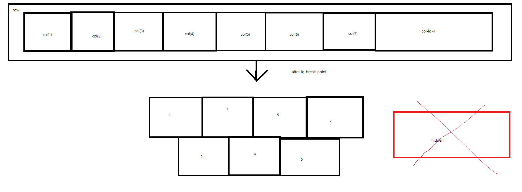
There are a total of 8 cols here. When the browser size is smaller than the lg breakpoint, I want to make it work like the picture above.
But when I tried it, it became like this. I can’t get a sense from my knowledge. Please advise.
Advertisement
Answer
BS4 uses CSS via class and is based on flex, you do not want to use CSS, but it does 😉
breakpoints are also integrated and used via built-in class.
To know a minimum about CSS, the flex model and mediaquerie will help to use bootstrap class, at least, you have to take time to read the documentation.
here an example of what you probably try to do :
/*see us*/

.row {
  counter-reset: divs
}

.row>div:before {
  counter-increment: divs;
  content: counter(divs);
}
<link href="https://cdnjs.cloudflare.com/ajax/libs/twitter-bootstrap/4.5.0/css/bootstrap.min.css" rel="stylesheet"/>
<div class="container">
<div class="row ">
<div class="col-3 col-lg-1 border"></div>
<div class="col-3 col-lg-1 order-1 order-lg-0 ml-auto ml-lg-0 border"></div>
<div class="col-3 col-lg-1 border"></div>
<div class="col-3 col-lg-1 order-1 order-lg-0 border"></div>
<div class="col-3 col-lg-1 border"></div>
<div class="col-3 col-lg-1 order-1 order-lg-0 mr-auto mr-lg-0 border"></div>
<div class="col-3 col-lg-1 border"></div>
<div class="col-lg-4 d-none d-lg-block border"></div>
</div>
</div>