I have a problem with Bootstrap 4 navbar collapse feature. I set it so that the navbar collapse in mobile viewport but instead of collapsing, it shows the items as a vertical list.
This is the code:
<html>
<body>
    <!-- Navbar -->
    <nav class="navbar navbar-expand-sm navbar-light">
        <div class="container">
            <button class="navbar-toggler" type="button" aria-label="collapse" data-target="#navbarSupportedContent" aria-controls="#navbarSupportedContent" aria-expanded="false" aria-label="Toggle navigation">
                <span class="navbar-toggle-icon"></span>
            </button>
            <div class="collapse navbar-collapse text-center justify-content-center" id="navbarSupportedContent">
                <a class="nav-link" href="#"><i class="far fa-dot-circle fa-lg pt-1"></i></a>
                <a class="nav-link" href="#">Menu</a>
                <a class="nav-link" href="#">Menu</a>
                <a class="nav-link" href="#">Menu</a>
                <a class="nav-link" href="#">Menu</a>
                <a class="nav-link" href="#">Menu</a>
            </div>
        </div>
    </nav>

    <script src="js/jquery-3.3.1.slim.min.js"></script>
    <script src="js/bootstrap.bundle.min.js"></script>
</body>
</html>
I’m using a customized version of Bootstrap 4 (compiled from scss). I tried to use the standard version and it does show the button instead of the vertical list, but it doesn’t work too. When I click on the list, nothing happens. I checked the browser console but it doesn’t show any error.
If it helps this is the compiled CSS: https://pastebin.com/jKYGC5A7
And this is the SCSS: https://pastebin.com/bbQNCAvh
Advertisement
Answer
The navbar work with ul li item, here is a working example
<html>
<head>
<link rel="stylesheet" href="https://maxcdn.bootstrapcdn.com/bootstrap/4.0.0/css/bootstrap.min.css">
</head>
<body>
<nav class="navbar navbar-expand-lg navbar-light bg-light">
  <button class="navbar-toggler" type="button" data-toggle="collapse" data-target="#navbarNavDropdown" aria-controls="navbarNavDropdown" aria-expanded="false" aria-label="Toggle navigation">
    <span class="navbar-toggler-icon"></span>
  </button>
  <div class="collapse navbar-collapse" id="navbarNavDropdown">
    <ul class="navbar-nav">
      <li class="nav-item active">
        <a class="nav-link" href="#">MENU <span class="sr-only">(current)</span></a>
      </li>
      <li class="nav-item">
        <a class="nav-link" href="#">MENU</a>
      </li>
      <li class="nav-item">
        <a class="nav-link" href="#">MENU</a>
      </li>

    </ul>
  </div>
</nav>
<script src="https://code.jquery.com/jquery-3.2.1.slim.min.js" ></script>
<script src="https://cdnjs.cloudflare.com/ajax/libs/popper.js/1.12.9/umd/popper.min.js" ></script>
<script src="https://maxcdn.bootstrapcdn.com/bootstrap/4.0.0/js/bootstrap.min.js"></script>
</body>
</html>
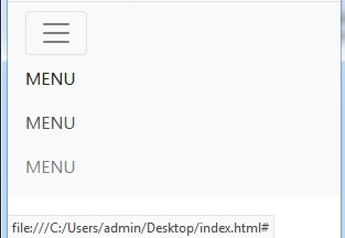
Here is a link in Codepen https://codepen.io/anon/pen/LdZYbP and here is a screenshot when you’re on a mobile view