

I am attempting to align an item, in this case a Font Awesome icon, to the end of a responsively sized card (width wise). I am struggling to get this to work. Here is my html for my card:
<div class="card mt-4 mycard">
    <a href="#" style="text-decoration: none; color: inherit">
        <div class="card-body">
            <h4 class="card-title">Card Title</h4>
            <p class="card-text">Description of card, chevron should be at the end of the card, vertically centred even when card width increases</p>
            <i class="fas fa-chevron-right fa-3x align-self-center"></i>
        </div>
    </a>
</div>
As you can see the chevron does not remain at the end of the card. Any help appreciated, thanks.
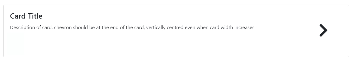
Here is what I want it to look like:
Advertisement
Answer
Best way I think to do this is like this:
a bit change on HTML structure, just pulled the icon outside the car-body div
<div class="container">
    <h2 style="margin-bottom: 3rem; margin-top: 1rem;">Align right in Bootstrap 4</h2>
    <div class="card mt-4 mycard">
        <a href="#" style="text-decoration: none; color: inherit">
            <div class="card-body">
                <h4 class="card-title">Card Title</h4>
                <p class="card-text">Description of card, chevron should be at the end of the card, vertically centred even when card width Description of card, chevron should be at the end of the card, vertically centred even when card width increases</p>
            </div>
            <i class="fas fa-chevron-right fa-3x align-self-center"></i>
        </a>
    </div>
</div>
CSS
<style>
    i {
        position: absolute;
        top: 50%;
        right: 20px;
        transform: translate(0,-50%);
    }
    .card-body {
        padding-right: 50px;
    }
</style>