
I’m building table that should display data in a reasonable way. And don’t take 100% width if it’s not needed.
The problem is that in one column I use line chart, and when I build that chart with div it works well, but when I use SVG the table takes 100% (I prefer to use SVG as it more flexible).
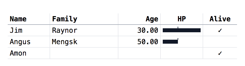
Below is how the table should look like (and it looks like that if div used instead of SVG to display line chart):
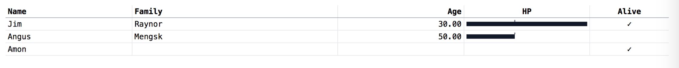
And that’s how the table looks when SVG is used, taking the whole page width
I assume it’s because SVG tries to grab as much space as possilbe and it inflate table to 100%.
How it could be fixed? I’m using table fixed layout and fixed percentage column width. I don’t know the data that’s going to be displayed in the table and the table width beforehand, table should determine the optimal width automatically.
Simplified example:
table { table-layout: fixed; max-wdith: 100% }
tr > * { border: 1px solid black; }
svg { display: block; }
<table>
<tr>
<th style="width: 50%;">a</th>
<th style="width: 50%;">b</th>
</tr>
<tr>
<td>a</td>
<td>
<svg height="1rem" width="100%">
<rect x="0%" y="25%" width="100%" height="50%" fill="black"/>
</svg>
</td>
</tr>
</table>P.S.
One possible way to fix it would be to hide SVG line plots initially, and let the table be rendered without SVG. And then after 1ms or so, when the table is rendered, measure table width and set that width explicitly with JS. And then display the SVG lines, and table will be limited by the explicit widht measured before. But maybe there’s easier way?
Advertisement
Answer
Here is a trick to disable the contribution of the SVG to the width. You simply set width:0 and add min-width:100% to recover the full width again:
It should work on your real example (I have tested)
table {
  table-layout: fixed;
  max-wdith: 100%
}

tr>* {
  border: 1px solid black;
}

svg {
  display: block;
  width:0;
  min-width:100%;
}
<table>
<tr>
<th style="width:50%;">aaa</th>
<th style="width:50%;">bbb</th>
</tr>
<tr>
<td>a</td>
<td>
<svg height="1rem" >
<rect x="0%" y="25%" width="100%" height="50%" fill="black"/>
</svg>
</td>
</tr>
</table>
<table>
<tr>
<th style="width:50%;">aaa</th>
<th style="width:50%;">bbbbbbb</th>
</tr>
<tr>
<td>a</td>
<td>
<svg height="1rem">
<rect x="0%" y="25%" width="100%" height="50%" fill="black"/>
</svg>
</td>
</tr>
</table>Related: How to match width of text to width of dynamically sized image/title?