

Phone Content
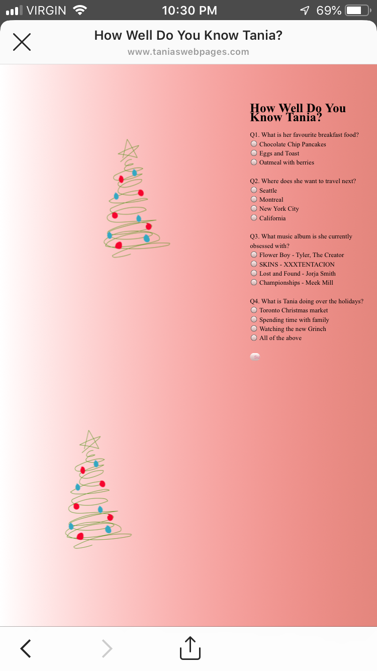
The image I have attached is a screenshot of how my webpage https://www.taniaswebpages.com looks. Everything is shifted to the right.
When I work on this page in Brackets, my content is kind of centred but mostly towards the left, and the 2 trees are on the right side. I am doing a website challenge for 180 days, and I am struggling. Hoping someone can help me, since I am new at this coding stuff. The content starts stacking in a weird way when I view the webpage on my phone.
this is my html:
<!DOCTYPE HTML>
<html lang="en" dir="ltr">

<meta name="viewport" content="width=device-width,height=device-height,initial-scale=1.0"/>
<meta charset="utf-8">


<link href="taniaWebsite2.css" type="text/css" rel="Stylesheet" />
<title> How Well Do You Know Tania?</title>


<body class="mainpage3">


<h1> How Well Do You Know Tania?</h1>

<form name="Questionaire">

Q1. What is her favourite breakfast food? <br>
    <input type="radio" name="q1" value="a"> Chocolate Chip Pancakes <br>
    <input type="radio" name="q1" value="b"> Eggs and Toast <br>
     <input type="radio" name="q1" value="c"> Oatmeal with berries <br><br>

Q2. Where does she want to travel next?<br>
    <input type="radio" name="q2" value="a"> Seattle <br>
    <input type="radio" name="q2" value="b"> Montreal <br>
     <input type="radio" name="q2" value="c"> New York City <br>
      <input type="radio" name="q2" value="d"> California <br><br>

Q3. What music album is she currently obsessed with?<br>
    <input type="radio" name="q3" value="a"> Flower Boy - Tyler, The Creator <br>
    <input type="radio" name="q3" value="b"> SKINS - XXXTENTACION <br>
     <input type="radio" name="q3" value="c"> Lost and Found - Jorja Smith  <br>
      <input type="radio" name="q3" value="d"> Championships - Meek Mill <br><br>

Q4. What is Tania doing over the holidays?<br>
     <input type="radio" name="q4" value="a"> Toronto Christmas market <br>
    <input type="radio" name="q4" value="b"> Spending time with family <br>
     <input type="radio" name="q4" value="c"> Watching the new Grinch   <br>
      <input type="radio" name="q4" value="d"> All of the above <br><br>


<input type="button" value="Submit" onclick="check()">


</form>

<script>

function check(){
    var q1=document.Questionaire.q1.value;
    var q2=document.Questionaire.q2.value;
    var q3=document.Questionaire.q3.value;
    var q4=document.Questionaire.q4.value;
    var count=0;

    if(q1=="a"){
        count++;

    }if (q2=="c"){
        count++;

    }if (q3=="a"){
        count++;
    }if(q4=="d"){
        count++;

    }alert("You received "+count+" out of 4");


}

</script>


 <img src="tree.png" class="image1" width=200 height=350 >
 <img src="tree2.png" class="image2" width=200 height=350 >


</body>

</html>
this is my css:
body.mainpage2{
margin:0;
padding:0;
font-family:lato;
background-color:#e74c3c;
}


.color{
margin-top:350px;
text-align:center;
}

 #hex{
display:block;
color:white;
font-size:40px;
text-transform: uppercase;
margin:15px;
letter-spacing: 0.1em;
}

.color button{
background:none;
outline:none;
color:white;
border:2px solid white;
cursor:pointer;
font-size:22px;
border-radius: 5px;
box-shadow: 5px 6px 30px 5px #fff;
width:200px;

}

body.mainpage3{
background-image: linear-gradient(to right, rgba(255,0,0,0), rgba(221, 106, 95, 0.81));
margin: 0 auto;
max-width: 800px;
padding: 2em 2em 4em;
font-family:Lato;
font-size:16.5px;
line-height: 24px;
float;align-content: flex-start;
display: block;


}

input[type=button]{
width:8%;
border:none;
padding: 8px 8px;
cursor:pointer;
color:palevioletred;

}

 .image1 {

position: relative;
right:-400px;
bottom:600px;
animation: shake 0.9s;
 animation-iteration-count: infinite;


}

.image2{
position:relative;
right:-100px;
bottom:200px;
animation: shake 0.9s;
animation-iteration-count: infinite;

}


 @keyframes shake {
  0% { transform: translate(1px, 1px) rotate(0deg); }
  10% { transform: translate(-1px, -2px) rotate(-1deg); }
  20% { transform: translate(-3px, 0px) rotate(1deg); }
  30% { transform: translate(3px, 2px) rotate(0deg); }
  40% { transform: translate(1px, -1px) rotate(1deg); }
  50% { transform: translate(-1px, 2px) rotate(-1deg); }
  60% { transform: translate(-3px, 1px) rotate(0deg); }
  70% { transform: translate(3px, 1px) rotate(-1deg); }
  80% { transform: translate(-1px, -1px) rotate(1deg); }
  90% { transform: translate(1px, 2px) rotate(0deg); }
  100% { transform: translate(1px, -2px) rotate(-1deg); }
 }
Advertisement
Answer
Change your CSS code for .image -like this:
 .image1, .image2 {
   position: absolute; /* necessary for absolute position... dont use relative */
   right:0; /* two trees are on the right side */
   animation: shake .9s infinite /* shorthand animation property */
 }
 .image1{top:0}
 .image2{top:350}
And, on small-screen devices, you can use this code (see below) to prevent images from going above the site content.
 @media (max-width: 700px) {
   .image1,.image2 {
     position:relative; /* relative to the normal flow */
     top:0; /* to reset the .image2 top value */
     margin:auto; /* to center the images */
     display:block /* block images optional */
   }
 }