
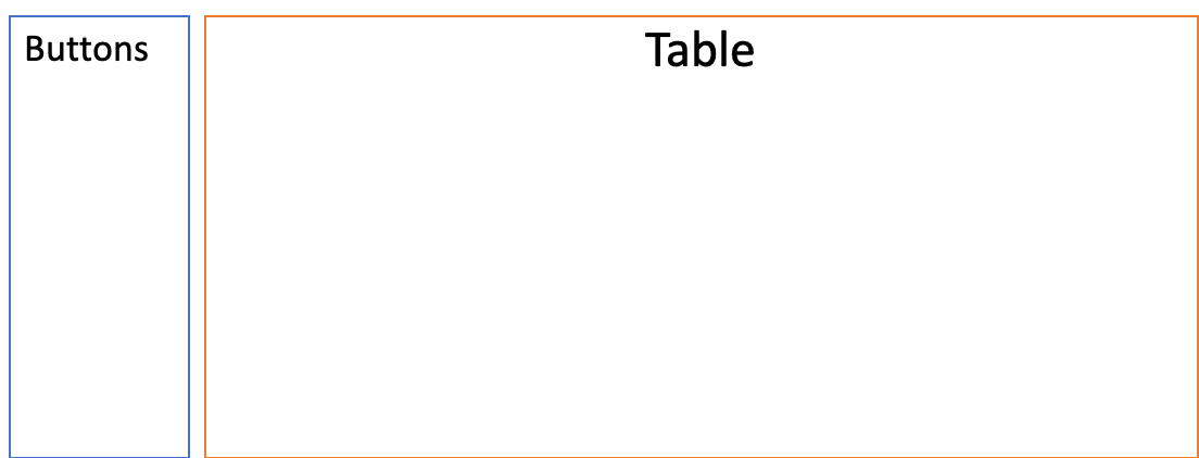
HI I am now working on a webpage.In the page I have a left part and right part. The right part has a table view, and the left part just some buttons. it looks like this:
It looks good now. but when I zoom in my browser to like 150%, 160%…, the right part(table) will expand its bottom vertically because of the content. like this:
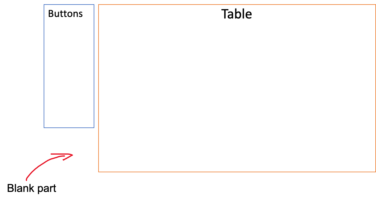 So you can see the bottom of two div are not aligned horizontally
.
So you can see the bottom of two div are not aligned horizontally
.
So my question is how to keep this to bottom always in a same line.
Yeah maybe you will say: fill the all background to white then people cannot realize that. But I need to keep the border lines and they should be in same line.
My current code is like this(there are some dependencies, but they are just child components to generate data):
firstly, my html file:
<div class="container-fluid vuln-content">
  <div class="row">
    <div class="col-2 filter-container">
      <div id="filter-card">
        <app-vuln-filter [currentSelectedTabIndex]="currentSelectedTabIndex"></app-vuln-filter>
      </div>
    </div>
    <div class="col-10">
          <p-tabView (onChange)="onClick($event)" styleClass="vuln-tabs">
            <p-tabPanel *ngFor="let gridConfig of gridTabConfigs" id={{gridConfig.id}} header={{gridConfig.header}}>
              <app-vul-ami-grid [gridConfig]="gridConfig"></app-vul-ami-grid>
            </p-tabPanel>
          </p-tabView>

    </div>
  </div>
</div>
I used some primeng tools like table, tab ..And you can see the ‘col-2’ part is the left, the ‘col-10’ part is the right.
also I have css file, it is kind of trival:
.vuln-content {
  min-height: calc(100vh - 37px);
  //height: calc(100vh - 35px);

  .filter-container {
    margin: 10px 0 0;
    background: #FFFFFF;
  }

  & > div.row {
    margin: 0 0 0 -10px;
  }
}
Maybe it need javascript(I use angular) to solve it? If so, absolutely fine. I like to learn javascript.
Advertisement
Answer
You seem to be using Bootstrap.
In this case you can consider using flexbox, which will stretch your rows vertically and equally.
Here is the link to reference:
https://getbootstrap.com/docs/4.4/utilities/flex/#align-items
<div class="d-flex align-items-stretch">...</div>