

I am having this problem for the 2nd time. At first I thought it was because I was a rookie (I’m new to this field) when I asked the employees at work and they couldn’t figure it out (I work as an intern). The problem is that when I decrease the height, the height occupied by the html page changes, but the items inside the divs try to overflow. I have difficulty in describing the problem, but it will be more meaningful with pictures.
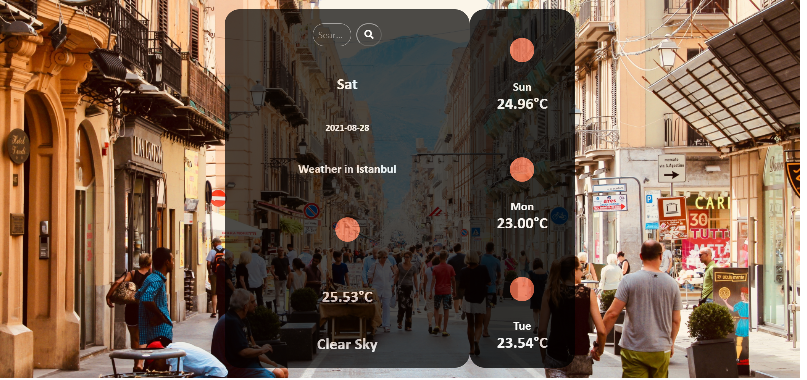
Normal page without problem:
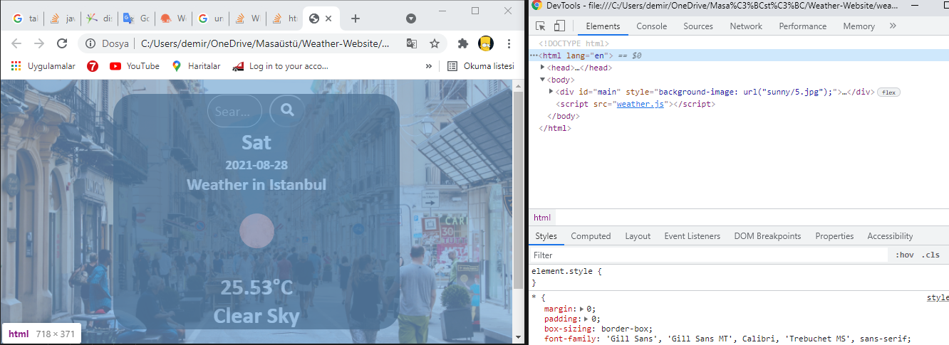
Problem:
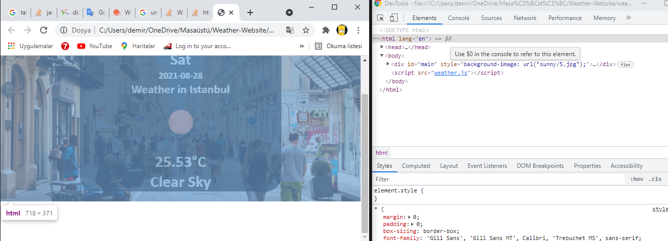
Continuation of problem:
As can be seen from the pictures, how can this be possible or how can I solve it.
let weather = {
  apiKey: "f2b412c0e169b2dbc28e13691fcf8c6b",
  fetchWeather: function(city) {
    fetch(
        "https://api.openweathermap.org/data/2.5/forecast?q=" +
        city +
        "&units=metric&appid=" +
        this.apiKey
      )
      .then((response) => response.json())
      .then((data) => this.displayWeather(data));
  },
  displayWeather: function(data) {


    for (i = 0; i <= 24; i += 8) {
      if (i == 0) {
        const {
          name
        } = data.city;
        let {
          icon,
          description
        } = data.list[i].weather[0];
        const {
          temp
        } = data.list[i].main;
        const {
          dt_txt
        } = data.list[i];

        if (icon == "01n") {
          icon = "01d";
        } else if (icon == "02n") {
          icon = "02d";
        } else if (icon == "10n") {
          icon = "10d";
        }


        document.querySelector("#city").innerText = "Weather in " + name;
        document.querySelector("#icon").src = "https://openweathermap.org/img/wn/" + icon + "@2x.png";
        document.querySelector("#description").innerText = description;
        document.querySelector("#temp").innerText = temp.toFixed(2) + "°" + "C";
        document.querySelector("#day").innerText = String(new Date(dt_txt)).slice(0, 3);
        document.querySelector("#Date").innerText = String(dt_txt).slice(0, 10);

        //Sunny
        if (icon == "01d" || icon == "01n") {
          ChangeBgSunny();

          function ChangeBgSunny() {
            console.log('geldi');
            const images = [
              'url("sunny/1.jpg")',
              'url("sunny/2.jpg")',
              'url("sunny/3.jpg")',
              'url("sunny/4.jpg")',
              'url("sunny/5.jpg")',

            ]
            console.log('geldi2');

            const main = document.querySelector('#main');
            const bg = images[Math.floor(Math.random() * images.length)];
            main.style.backgroundImage = bg;

          }
        }
        //Rainy
        else if (icon == "10d" || icon == "09d" || icon == "09n") {
          ChangeBgRainy();

          function ChangeBgRainy() {
            console.log('geldi');
            const images = [
              'url("rain/1.jpg")',
              'url("rain/2.jpg")',
              'url("rain/3.jpg")',
              'url("rain/4.jpg")',
              'url("rain/5.jpg")',

            ]
            console.log('geldi2');

            const main = document.querySelector('#main');
            const bg = images[Math.floor(Math.random() * images.length)];
            main.style.backgroundImage = bg;

          }
        }
        //Cloud
        else if (icon == "02d" || icon == "03d" || icon == "03n" || icon == "04d" || icon == "04n") {
          ChangeBgcloud();

          function ChangeBgcloud() {
            console.log('geldi');
            const images = [
              'url("cloud/1.jpg")',
              'url("cloud/2.jpg")',
              'url("cloud/3.jpg")',
              'url("cloud/4.jpg")',
              'url("cloud/5.jpg")',

            ]
            console.log('geldi2');

            const main = document.querySelector('#main');
            const bg = images[Math.floor(Math.random() * images.length)];
            main.style.backgroundImage = bg;

          }
        }


      } else if (i == 8) {
        const {
          name
        } = data.city;
        let {
          icon,
          description
        } = data.list[i].weather[0];
        const {
          temp
        } = data.list[i].main;
        const {
          dt_txt
        } = data.list[i];

        if (icon == "01n") {
          icon = "01d";
        } else if (icon == "02n") {
          icon = "02d";
        } else if (icon == "10n") {
          icon = "10d";
        }


        document.querySelector("#icon1").src = "https://openweathermap.org/img/wn/" + icon + "@2x.png";
        document.querySelector("#day1").innerText = String(new Date(dt_txt)).slice(0, 3);
        document.querySelector("#temp1").innerText = temp.toFixed(2) + "°" + "C";
      } else if (i == 16) {
        const {
          name
        } = data.city;
        let {
          icon,
          description
        } = data.list[i].weather[0];
        const {
          temp
        } = data.list[i].main;
        const {
          dt_txt
        } = data.list[i];

        if (icon == "01n") {
          icon = "01d";
        } else if (icon == "02n") {
          icon = "02d";
        } else if (icon == "10n") {
          icon = "10d";
        }


        document.querySelector("#icon2").src = "https://openweathermap.org/img/wn/" + icon + "@2x.png";
        document.querySelector("#day2").innerText = String(new Date(dt_txt)).slice(0, 3);
        document.querySelector("#temp2").innerText = temp.toFixed(2) + "°" + "C";
      } else if (i == 24) {
        const {
          name
        } = data.city;
        let {
          icon,
          description
        } = data.list[i].weather[0];
        const {
          temp
        } = data.list[i].main;
        const {
          dt_txt
        } = data.list[i];

        if (icon == "01n") {
          icon = "01d";
        } else if (icon == "02n") {
          icon = "02d";
        } else if (icon == "10n") {
          icon = "10d";
        }


        document.querySelector("#icon3").src = "https://openweathermap.org/img/wn/" + icon + "@2x.png";
        document.querySelector("#day3").innerText = String(new Date(dt_txt)).slice(0, 3);
        document.querySelector("#temp3").innerText = temp.toFixed(2) + "°" + "C";
      }
    }


  },
  search: function() {
    this.fetchWeather(document.querySelector(".search-item").value);
  },
};

document.querySelector(".button").addEventListener("click", function() {
  weather.search();
});

document.querySelector(".search-item").addEventListener("keyup", function(event) {
  if (event.key == "Enter") {
    weather.search();
  }
});

weather.fetchWeather("Istanbul");
* {
margin: 0;
padding: 0;
box-sizing: border-box;
font-family: 'Gill Sans', 'Gill Sans MT', Calibri, 'Trebuchet MS', sans-serif;
}
.search-item {
color: gray;
font-size: 20px;
background-color: black;
width: 30%;
height: auto;
padding: 10px;
border-radius: 30px;
border: 1px solid gray;
transition: width 2s;
text-overflow: ellipsis;
}
.search-item:focus {
width: 90%;
background-color: white;
}
.button {
margin-left: 10px;
border-radius: 30px;
color: gray;
background-color: black;
width: 20%;
}
.days {
display: flex;
justify-content: center;
}
#Days:hover {
opacity: 1;
}
#search-main:hover {
opacity: 1;
}
#input {
display: flex;
justify-content: center;
}
#main {
width: 100%;
height: 100vh;
padding: 20px 100px 20px 100px;
display: flex;
flex-direction: row;
justify-content: center;
align-items: center;
background-repeat: no-repeat;
background-position: center;
background-size: cover;
}
#weather {
width: 50%;
height: 100%;
margin-top: 1%;
margin-bottom: 1%;
margin-left: 1%;
margin-right: 1%;
display: flex;
flex-direction: row;
justify-content: center;
align-items: center;
border-radius: 30px;
}
#search-main {
width: 70%;
height: 100%;
display: flex;
flex-direction: column;
justify-content: space-around;
align-items: center;
border-radius: 30px;
color: white;
background-color: black;
opacity: 0.7;
}
#Days {
width: 30%;
height: 100%;
display: flex;
flex-direction: column;
justify-content: space-around;
align-items: center;
background-color: black;
color: white;
opacity: 0.8;
border-radius: 30px;
}
#description {
text-transform: capitalize;
}
@media screen and (max-width:950px) {
#main {
padding-top: 20px;
padding-bottom: 20px;
padding-right: 0;
padding-left: 0;
}
#Days {
position: absolute;
visibility: hidden;
}
#weather {
width: 100%;
margin-right: 10%;
margin-left: 10%;
}
}<div id="main">
<div id="weather">
<div id="search-main">
<div id="input">
<input class="search-item" type="text" placeholder="Search City"><button class="button"><i class="fas fa-search fa-lg" style="color: white;"></i></button>
</div>
<div>
<h1 id="day"></h1>
</div>
<div>
<h3 id="Date"></h3>
</div>
<div>
<h2 id="city"></h2>
</div>
<h1><img src="" id="icon"></h1>
<div>
<h1 id="temp"></h1>
</div>
<div>
<h1 id="description"> </h1>
</div>
</div>
<div id="Days">
<div id="First-day" style="opacity:1;">
<h1><img src="" id="icon1" style="opacity:1 !important;"></h1>
<div class="days">
<h2 id="day1"></h2>
</div>
<div>
<h1 id="temp1"></h1>
</div>
</div>
<div id="Second-day">
<h1><img src="" id="icon2"></h1>
<div class="days">
<h2 id="day2"></h2>
</div>
<div>
<h1 id="temp2"></h1>
</div>
</div>
<div id="Third-day">
<h1><img src="" id="icon3"></h1>
<div class="days">
<h2 id="day3"></h2>
</div>
<div>
<h1 id="temp3"></h1>
</div>
</div>
</div>
</div>
</div>Advertisement
Answer
You can add overflow: hidden to both the divs (#search-main and #Days) like Wiktor mentioned. Further, as the overflowed data is not visible, you can try these.
As you can see from the below image, the reason you see some white space below is because, after you have reduced the width, the visibility of the right div #Days is set to hidden in the media queries.
Now when you are reducing the height, the right div is still present there, just not visible. The items inside the right div is causing the overflow.
So in the media queries, instead of visibility:hidden
You can do display:none
  #Days {
    position: absolute;
    display: none;
  }
display: none; will completely remove the div instead on hiding it.

Now, when you continue to reduce the height of the window, you will still see the items are getting overflowed from the div causing white space below because we didn’t do anything to prevent the overflow.
The items inside the divs #search-main and #Days are overflowing because there is no space left between those elements.
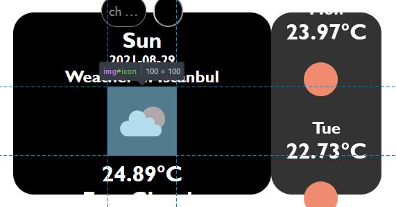
The empty space you see is occupied by the images that are 100px x 100px.
So what you can do is instead of setting height: 100% add min-height: 100% to both the divs
#search-main {
  width: 70%;
  min-height: 100%;
  display: flex;
  flex-direction: column;
  justify-content: space-around;
  align-items: center;
  border-radius: 30px;
  color: white;
  background-color: black;
  opacity: 0.7;
}

#Days {
  width: 30%;
  min-height: 100%;
  display: flex;
  flex-direction: column;
  justify-content: space-around;
  align-items: center;
  background-color: black;
  color: white;
  opacity: 0.8;
  border-radius: 30px;
}
Setting min-height: 100% will not allow the items to overflow from it’s parent div.
If you don’t want the divs to overflow its parent or from body. You have to keep the height of the child divs less than or equal to the parent div.