
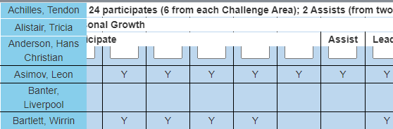
I have a large table that is scrolling on the horizontal and vertical with the first column sticky and the three header rows sticky. This works to a point. However the table extends past the right side of the screen.
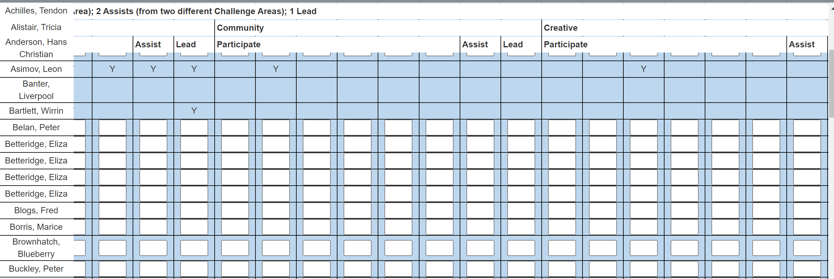
I would like it to remain in the boundaries of the screen. From the image you can see I have two issues:
- The table extends past the end of the screen on the right
- The Name heading is behind the list of names when scrolled (this does not happen in the attached jfiddle)
When I add this css:
table {
    display: block;
    overflow: scroll;
}
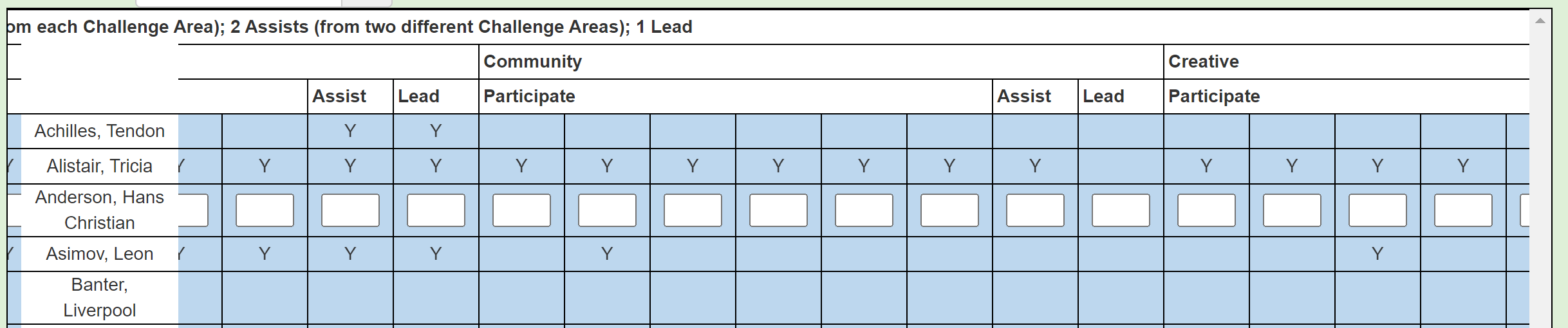
The table is within the boundary of the screen; however the sticky on the heading rows does not work. The left column sticky is also not as good (please see the image).
Please see my attempt at a jfiddle; however, I can not get the Bootstrap to work (I included the cdns).
https://jsfiddle.net/Glyndwr/2tfLu87a/11/
My aim is to have the:
- Table stay within the boundaries of the screen
- Top heading rows and left column stick when I scroll
- Name heading remain in front when I scroll
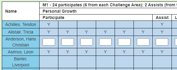
A bit more of an explanation relating to making the “Name” cell in the top right corner sticky. This is the starting position:
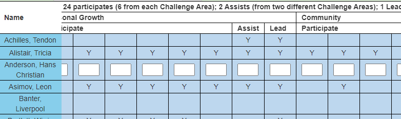
When I scroll right the “Name” column is in front, which is correct:
However, when I scroll down the “Name” cell does not stick:
So what I need is for the “Name” cell to stick on both scroll right and down.
Advertisement
Answer
You can set/make the thead itself sticky instead of individual rows/trs. As for the names in the row, since they’re first-child of each tbody‘s trs you can select them and apply styles, like so:
tbody>tr>td:first-child{
  background: red;
  position: sticky;
  left: 0;
}
You can then wrap the table inside a block container to give it vertical and horizontal scrolling. See the CSS example below:
.table-wrapper{
  margin: 0 auto;
  display: block;
  width: 98vw;
  height: 95vh;
  overflow: auto;
  border: 1px solid black;
}
I’ve edited your jsfiddle here.