
I am having a slight issue with my sticky nav bar.
I have a follow us section above the nav bar and what I want to do is that if the user scrolls, for the nav bar to snap back to top of the page. I can’t set top:0 initially because it will cover the follow us. So I need it stick once scrolling.
Best way to explain it is through this w3 schools example where the header sticks after scrolling past the above content:
https://www.w3schools.com/howto/tryit.asp?filename=tryhow_js_navbar_sticky
I tried following the above example but doesn’t work for me, if you look at the screenshots below.
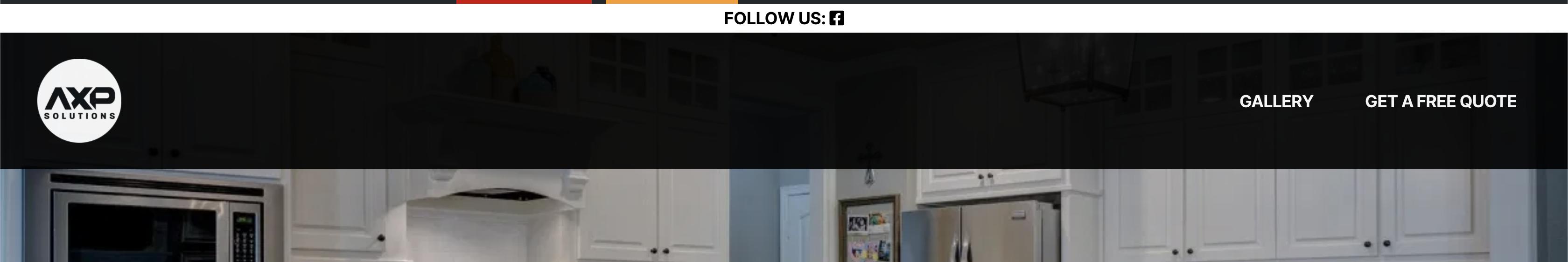
Here is the initial page load with the follow us on top of page.
The moment I scroll you can see there’s a gap above.

HTML:
<header id="site-header" class="header-footer-group _mPS2id-t mPS2id-target mPS2id-target-first mPS2id-target-last" role="banner">
...

</header>
Javascript:
<head>
<script>
window.onscroll = function() {myFunction()};

var navbar = document.getElementById("site-header");
var sticky = navbar.offsetTop;

function myFunction() {
  if (window.pageYOffset >= sticky) {
    navbar.classList.add("sticky")
  } else {
    navbar.classList.remove("sticky");
  }
}
</script>
</head>
CSS:
#site-header{
    opacity: 0.9;
    width:100% !important;
    z-index:99999;
  position:fixed;
}
Advertisement
Answer
Please Use This CSS
.sticky {position: -webkit-sticky; /* Safari */
  position: sticky;
  top: 0;
}