

I’m working on the following files:
* {
  margin: 0;
  padding: 0;
  box-sizing: border-box;
}

body {
  background: #e4e4e4;
  text-align: center;
}

.content {
  background: #fff;
  padding: 20px 40px;
  width: 60%;
  margin: 20px auto;
}

.container {
  border: 1px solid black;
  padding: 0 40px 40px 40px;
  background: #fff;
}
<html lang="en">
<head>
<meta charset="UTF-8" />
<meta name="viewport" content="width=device-width, initial-scale=1.0" />
<link rel="stylesheet" href="style.css" />
<title>Document</title>
</head>
<body>
<div class="content">
<div id="d1" class="container">
1
<div id="d2" class="container">
2
<div id="d3" class="container">3</div>
</div>
</div>
</div>
</body>
</html>The result I want to achieve is that when I hover a certain div, its background changes to a #ccc grey color.
However what adds some difficulty is that I want only the area that belongs only to the innermost hovered div to change background color, not the child or parent.
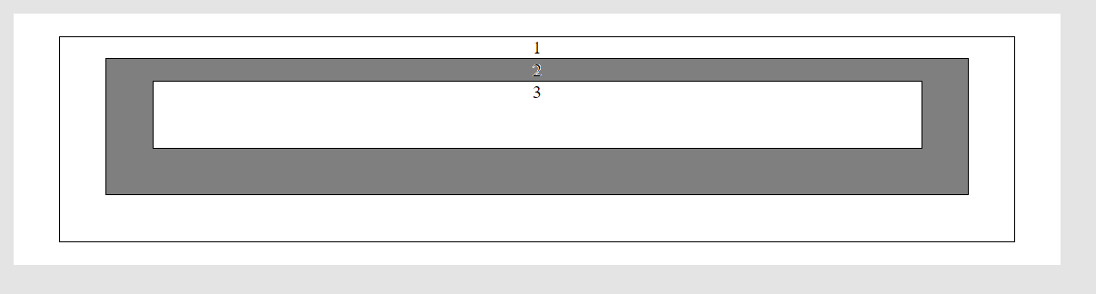
Here is a picture to show the behavior I want for example when hovering the second div:
EDIT: I ALSO WANT THE BACKGROUND COLOR TO BE RESET TO WHITE WHEN THE MOUSE IS OUTSIDE AN AREA
EDIT 2: IS THIS DOABLE WITH ONLY CSS OR IS JAVASCRIPT MANDATORY?
Advertisement
Answer
Some magic using pseudo element and box-shadow:
* {
  margin: 0;
  padding: 0;
  box-sizing: border-box;
}

body {
  background: #e4e4e4;
  text-align: center;
}

.content {
  background: #fff;
  padding: 20px 40px;
  width: 60%;
  margin: 20px auto;
  position:relative;
  z-index:0; /* this is important */
  overflow:hidden; /* hide the extra box-shadow */
}

.container {
  border: 1px solid black;
  padding: 0 40px 40px 40px;
  position:relative; /* dont forget relative here */
  background:#fff;
}
.container::before,
.container::after{
  content:"";
  position:absolute;
  z-index:-1;
  top:-1px;
  left:-1px;
  right:-1px;
  bottom:-1px;
}
.container::before {
  background:grey;
}
/* on hover */
.container:hover::after {
  box-shadow:0 0 0 200vmax #fff; /* hide the upper div */
}
.container:hover {
  background:transparent; /* make the hovered div transaprent to see the "before" element */
}
/**/
<div class="content">
<div id="d1" class="container">
1
<div id="d2" class="container">
2
<div id="d3" class="container">3</div>
</div>
</div>
</div>