
I have a half-circle (green) and an object (blue). I want to move that object on that circle from start (left) to end (right). The object should follow the path (black) of the half-circle.
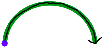
Object should move based on specific value. Value is a number from 0 to 1. Start = 0, end = 1.
My current solution:
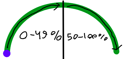
- translate the value to percentages by multiplying it by 100. So, 0 = 0%, 0.5 = 50%, 1 = 100%
- the object is an absolute element which is placed inside relative container
- half circle also placed inside relative container, but it is not absolute
- the object will be moved using CSS
leftandbottom, initial values are0% - first half of the half-circle is a
0-49%, second half is a50-100% - I’m also using
paddingfor the half-circle andtranslatefor the object.paddingonly needed for nice look and doesn’t actually affects at solution.translateis necessary for right position ofleftandbottomthat are relative to “relative container”
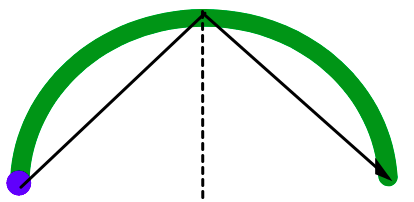
I figured out how to move the object over Y-axis:
// p is from 0 to 100
const bottom = (
    p < 50 ?
    p * 2 :
    100 - (p - 50) * 2
);
But I can’t figure how to correctly move over X-axis. At the moment I have this:
const left = p;
Which gives me this result:
So, how to correctly move the object over X-axis? Or maybe there is a better solution for both X- and Y-axis?
Please note:
- most likely it should be JavaScript-dependent solution, not CSS only. I need to have control over
value. I will set it manually and will update it manually. Sometimes there will be no animation at all because I will not iterate from 0 to 1, but set it only once. - I need to interact with these two
<svg>elements, not create my own elements. The reason is that every<svg>have linear gradient fill, and it can’t be done correctly withborder.
Here is snippet of my current solution:
async function main() {
    let value = 0; // from 0 to 1

    while (value < 1) {
        await new Promise((resolve) => {
            window.setTimeout(resolve, 10);
        });
        value += 0.01;
        move(value);
    }

}

function move(value) {
    const p = 100 * value;
    const bottom = (
        p < 50 ?
        p * 2 :
        100 - (p - 50) * 2
    );
    const left = p;
    const css = {
        left: `${left}%`,
        bottom: `${bottom}%`,
        transform: `translate(-${left}%, ${bottom}%)`,
    };
    const element = document.getElementById("ellipse-2-container")

    element.style.left = css.left;
    element.style.bottom = css.bottom;
    element.style.transform = css.transform;
}

main()
.root {
position: relative;
width: 20rem;
}
.ellipse-1 {
width: 100%;
height: auto;
box-sizing: border-box;
padding: 0.3rem;
}
.ellipse-2 {
width: 1.5rem;
height: auto;
}
.ellipse-2-container {
position: absolute;
left: 0;
bottom: 0;
display: flex;
}<div class="root">
<svg class="ellipse-1" xmlns="http://www.w3.org/2000/svg" width="272" height="125" viewBox="0 0 272 125"
fill="none">
<path
d="M265.2 124.5C268.956 124.5 272.021 121.452 271.797 117.703C269.975 87.1607 255.916 58.2064 232.167 36.4652C206.662 13.1169 172.069 2.4929e-06 136 0C99.9306 -2.4929e-06 65.3384 13.1169 39.8335 36.4652C16.084 58.2064 2.0254 87.1607 0.202617 117.703C-0.0211153 121.452 3.04446 124.5 6.8 124.5C10.5555 124.5 13.5766 121.451 13.8251 117.704C15.6319 90.4658 28.2517 64.6746 49.4501 45.2687C72.4046 24.2552 103.538 12.45 136 12.45C168.463 12.45 199.595 24.2552 222.55 45.2687C243.748 64.6746 256.368 90.4658 258.175 117.704C258.423 121.451 261.444 124.5 265.2 124.5Z"
fill="green">
</path>
</svg>
<div class="ellipse-2-container" id="ellipse-2-container">
<svg
class="ellipse-2" xmlns="http://www.w3.org/2000/svg" width="30" height="30" viewBox="0 0 30 30"
fill="none">
<path
d="M27.1759 15C27.1759 21.9292 21.6265 27.5 14.838 27.5C8.04943 27.5 2.5 21.9292 2.5 15C2.5 8.07077 8.04943 2.5 14.838 2.5C21.6265 2.5 27.1759 8.07077 27.1759 15Z"
fill="blue">
</path>
</svg>
</div>
</div>Note about solution.
I used Temani Afif solution, but with little modification. In the question I pointed that I need to keep these two <svg> elements. So, I set div.arc border color to transparent, remove unnecessary :before, :after. Set div.arc to position: relative and my children <svg> as position: absolute. After alignment it looks like the object moving over the <svg> element, but actually it moving over div.arc.
Advertisement
Answer
What about a CSS only and easier solution:
.arc {
  width:250px;
  aspect-ratio:2/1;
  border:20px solid blue;
  border-bottom:0;
  border-radius:200px 200px 0 0;
  box-sizing:border-box;
  display:grid;
}
.arc:before,
.arc:after,
.arc div{
  content:"";
  width:20px;
  aspect-ratio:1/1;
  border-radius:50%;
  grid-area:1/1;
  background:blue;
}
.arc > div {
  background:lightgreen;
  margin:auto auto -10px;
  animation:a 3s linear both 1s;
}
@keyframes a{ /* 115px = (250px - 20px)/2 */
  from {transform:rotate(-180deg) translate(115px)}
  to   {transform:rotate(   0deg) translate(115px)}
}

.arc:before {
  margin:auto auto -10px -20px;
}
.arc:after {
  margin:auto -20px -10px auto;
}
<div class="arc"> <div></div> </div>
Using CSS variables to control the value:
.arc {
  width:250px;
  aspect-ratio:2/1;
  border:20px solid blue;
  border-bottom:0;
  border-radius:200px 200px 0 0;
  box-sizing:border-box;
  display:grid;
}
.arc:before,
.arc:after,
.arc div{
  content:"";
  width:20px;
  aspect-ratio:1/1;
  border-radius:50%;
  grid-area:1/1;
  background:blue;
}
.arc > div {
  background:lightgreen;
  margin:auto auto -10px;
  transform:rotate(calc(180deg*var(--x) - 180deg)) translate(115px)
}


.arc:before {
  margin:auto auto -10px -20px;
}
.arc:after {
  margin:auto -20px -10px auto;
}
<div class="arc" style="--x:0"> <div></div> </div> <div class="arc" style="--x:0.2"> <div></div> </div> <div class="arc" style="--x:0.6"> <div></div> </div> <div class="arc" style="--x:1"> <div></div> </div>