

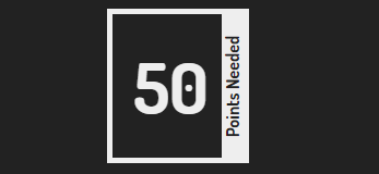
I am looking to create a division with border like the following PNG
I have planned to make an ::after element with the following dimensions:
width=height of the parent division;
height=1.5em;
The following is the code works fine but the width of the ::after element is not right…
body {
  display: flex;
  flex-direction: column;
  height: 93vh;
  justify-content: center;
  align-items: center;
  background: #222;
  color: #eee;
  font-family: "Dosis", sans-serif;
}

.side-text {
  position: relative;
  font-size: 4em;
  color: #eee;
  background: none;
  padding: 0.4em 0.5em 0.4em 0.3em;
  border: 5px solid #eee
}

.side-text::after {
  position: absolute;
  content: "Points Needed";
  font-size: 0.25em;
  color: #222;
  background: #eee;
  text-align: center;
  width: 100%;
  /*This takes the value of 100%(Parent's Width) but we need 100%(Parents Height)*/
  transform: rotate(-90deg);
  left: 45%;
  top: 42.5%;
  /*The values of left, top have been assigned by trial & error, and will change with the length of the text in the parent division. If the text contained in the parent changes to say, 5000, the values specified above won't work */
}
<link href="https://fonts.googleapis.com/css?family=Dosis:700" rel="stylesheet" /> <div class="side-text"> 50 </div>
The values of left-margin, top-margin have been assigned by trial & error, and will change with the length of the text in the parent division. If the text contained in the parent changes to say, 5000 from 50, the values specified above won’t work.
Advertisement
Answer
You can consider writing-mode
body {
  display: flex;
  flex-direction: column;
  min-height: 93vh;
  align-items: center;
  background: #222;
  color: #eee;
  font-family: "Dosis", sans-serif;
}

.side-text {
  position: relative;
  font-size: 4em;
  color: #eee;
  background: none;
  padding: 0.4em 0.5em 0.4em 0.3em;
  border: 5px solid #eee;
  margin:5px;
}

.side-text::after {
  position: absolute;
  content: "Points Needed";
  font-size: 0.25em;
  color: #222;
  background: #eee;
  text-align: center;
  transform: rotate(-180deg);
  right: 0;
  top: -1px;
  bottom: -1px;
  writing-mode: vertical-lr;
}
<link href="https://fonts.googleapis.com/css?family=Dosis:700" rel="stylesheet" /> <div class="side-text"> 50 </div> <div class="side-text"> 5000 </div>
You can make it easier to approximate by adjusting transform-origin and then simply change the left property but it will remain an approximation.
body {
  display: flex;
  flex-direction: column;
  height: 93vh;
  justify-content: center;
  align-items: center;
  background: #222;
  color: #eee;
  font-family: "Dosis", sans-serif;
}

.side-text {
  position: relative;
  font-size: 4em;
  color: #eee;
  background: none;
  padding: 0.4em 0.5em 0.4em 0.3em;
  border: 5px solid #eee
}

.side-text::after {
  position: absolute;
  content: "Points Needed";
  font-size: 0.25em;
  color: #222;
  background: #eee;
  text-align: center;
  transform: rotate(-90deg) translateY(-100%);
  transform-origin: top right;
  right: 0px;
  left: -15px; /*adjust this*/
  top: 0;
}
<link href="https://fonts.googleapis.com/css?family=Dosis:700" rel="stylesheet" /> <div class="side-text"> 50 </div>
Another idea is to separate the content from the background. We keep the background inside the element and we simply need to put the text centered on the right and no need to bother about its width.
This will work in all the cases and you will probably have better support than writing-mode:
body {
  display: flex;
  flex-direction: column;
  min-height: 93vh;
  align-items: center;
  background: #222;
  color: #eee;
  font-family: "Dosis", sans-serif;
}

.side-text {
  position: relative;
  font-size: 4em;
  color: #eee;
  background: none;
  padding: 0.4em 0.5em 0.4em 0.3em;
  border: 5px solid #eee;
  background: linear-gradient(#eee, #eee) right/20px 100% no-repeat;
  margin:5px;
}

.side-text::after {
  position: absolute;
  content: "Points Needed";
  font-size: 0.25em;
  color: #222;
  text-align: center;
  top: 50%;
  right: 0;
  transform: translate(41%, -50%) rotate(-90deg);
}
<link href="https://fonts.googleapis.com/css?family=Dosis:700" rel="stylesheet" /> <div class="side-text"> 50 </div> <div class="side-text"> 5000 </div>