
Here is my model.
I would like this animation :
- When I swipe left, the month March takes the central place, and April replaces March in the right
- When I swipe right, the month January takes central place, and December replaces January in the left
I literally don’t know where to begin, or how to achieve this.
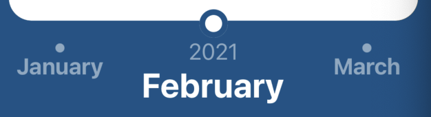
For the code used in the image, here it is :
import React from 'react';
import {View, StyleSheet, Text, TouchableOpacity} from 'react-native';

const MonthSlider = () => {
  return (
    <View
      style={{
        flexDirection: 'row',
        flex: 0.2,
        paddingBottom: 100,
      }}>
      <View
        style={{
          flexDirection: 'column',
          flex: 0.25,
          alignItems: 'center',
          marginTop: 10,
        }}>
        <TouchableOpacity
          style={{alignItems: 'center'}}
          onPress={() => alert('January clicked')}>
          <View style={styles.nonActiveCircle} />
          <Text style={styles.nonActiveMonth}>January</Text>
        </TouchableOpacity>
      </View>
      <View
        style={{
          flexDirection: 'column',
          flex: 0.5,
          alignItems: 'center',
          marginTop: 10,
        }}>
        <View style={styles.activeCircle} />
        <Text style={styles.year}>2021</Text>
        <Text style={styles.activeMonth}>February</Text>
      </View>
      <View
        style={{
          flexDirection: 'column',
          flex: 0.25,
          marginTop: 10,
          alignItems: 'center',
        }}>
        <TouchableOpacity
          style={{alignItems: 'center'}}
          onPress={() => alert('March clicked')}>
          <View style={styles.nonActiveCircle} />
          <Text style={styles.nonActiveMonth}>March</Text>
        </TouchableOpacity>
      </View>
    </View>
  );
};

const styles = StyleSheet.create({
  nonActiveMonth: {
    fontSize: 20,
    color: '#8BA8C3',
    fontWeight: 'bold',
  },
  activeMonth: {
    fontSize: 30,
    color: 'white',
    fontWeight: 'bold',
  },
  nonActiveCircle: {
    width: 8,
    height: 8,
    borderRadius: 8 / 2,
    backgroundColor: '#8BA8C3',
    marginTop: 10,
  },
  activeCircle: {
    width: 25,
    height: 25,
    borderRadius: 25 / 2,
    backgroundColor: 'white',
    borderWidth: 5,
    borderColor: '#175287',
    bottom: 20,
    marginBottom: -20,
  },
  year: {
    fontSize: 20,
    color: '#8BA8C3',
  },
});

export default MonthSlider;
Advertisement
Answer
Maybe a good start would be use ‘react-view-slider’ or ‘ScrollView’ and do something like this :
import React, { useState } from 'react';
import {View, StyleSheet, Text, TouchableOpacity} from 'react-native';
import Swiper from 'react-native-swiper';

const MonthSlider = () => {

  // Months
  const months = ["January","February","March","April","May","June","July","August","September","October","November","December"];

  // State iMonths
  const [ iMonth, setIMonth ] = useState(1);

  // Month click
  const MonthClick = (i) => {
    alert( months[i] +' clicked')
    setIMonth(i);
  };

  // This function renders the view at the given index.
  const renderView = ({ index, active }) => (
    months.map( (month,i) =>
      <View key={i} style={styles.month + ( active == i ) ? styles.active : styles.inactive }>
        <TouchableOpacity
          style={styles.bt}
          onPress={() => MonthClick(i)}
        >
            <View style={ active == i ? styles.activeCircle : styles.nonActiveCircle } />
            <Text style={ active == i ? styles.activeMonth : styles.nonActiveMonth }>{month}</Text>
        </TouchableOpacity>
      </View>
    )
  );

  return (
    <Swiper style={styles.monthWrapper} showsButtons={false} horizontal={true} showsPagination={false}>
      {renderView(0,0)}
    </Swiper>
  );
};

const styles = StyleSheet.create({

  /* New styles */
  monthWrapper:{
    flex:0.5,
    display:'flex',
    flexDirection: 'row',
    height:'100px',
    textAlign:'center',
  },
  bt:{
    textAlign:"center"
  },
  month:{
    alignItems: 'center',
    backgroundColor: '#9DD6EB'
  },
  active:{
    color:'#000',
    flex: 0.5,
    opacity:1,
    fontSize: 30,
    color: 'white',
    fontWeight: 'bold',
  },
  inactive: {
    fontSize: 20,
    color: '#8BA8C3',
    fontWeight: 'bold',
  },

  /* Old styles */
  nonActiveMonth: {
    fontSize: 20,
    color: '#8BA8C3',
    fontWeight: 'bold',
  },
  activeMonth: {
    fontSize: 30,
    color: 'white',
    fontWeight: 'bold',
  },
  nonActiveCircle: {
    width: 12,
    height: 12,
    borderRadius: '100%',
    backgroundColor: '#8BA8C3',
    marginTop: 10,
    alignSelf:'center'
  },
  activeCircle: {
    width: 40,
    height: 40,
    borderRadius: '100%',
    backgroundColor: 'white',
    borderWidth: 5,
    borderColor: '#175287',
    bottom: 20,
    marginBottom: -20,
  },
});

export default MonthSlider;