

I saw this cool scrolling effect online…
Where the image blends with the next image when scrolling through sections. I’ve been trying to reproduce it, but I can’t seem to figure it out? How can I create this effect on the web?
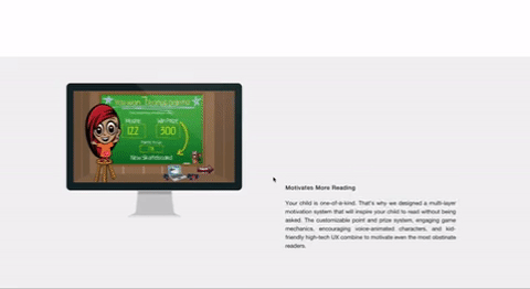
Here is the link to where I saw the effect… http://readingbuddysoftware.com/how-it-works/
I’ve tried using position: fixed on the screenshots with the z-index of the section higher then the image, but the last screenshot is always on the top.
Any ideas?
Update: For various reasons (including placement, using slants…), I can’t use the background-image css solution. I need a solution for using the <img> element.
Advertisement
Answer
This can be done using background-attchement:fixed and two similar images.
Here is a simple example:
body {
  min-height:200vh;
  margin:0;
  background:url(https://picsum.photos/id/1069/150/150?grayscale) 20px 20px no-repeat;
  background-attachment:fixed;
}

.box {
  margin-top:220px;
  height:200px;
  background:url(https://picsum.photos/id/1069/150/150) 20px 20px no-repeat,
  grey;
  background-attachment:fixed;
}
<div class="box"> </div>
That you can easily scale with many images:
body {
  min-height:250vh;
  margin:0;
  background:url(https://picsum.photos/id/1069/150/150?grayscale) 50px 50px/auto no-repeat;
  background-attachment:fixed;
}

.box {
  height:200px;
  background:url(https://picsum.photos/id/1069/150/150) 50px 50px/auto no-repeat,
  grey;
  background-attachment:fixed;
}
.box:first-child {
  margin-top:200px;
}
<div class="box"> </div> <div class="box" style="background-image:url(https://picsum.photos/id/11/150/150);background-color:yellow"> </div> <div class="box" style="background-image:url(https://picsum.photos/id/106/150/150);background-color:pink"> </div>
You can also consider the use of img and position:fixed but you will need some trick to hide the overflow using clip-path
body {
  min-height: 250vh;
  margin: 0;
  padding-top: 100px;
}

img {
  position: fixed;
  top: 50px;
  left: 50px;
}

.box {
  height: 200px;
  background: grey;
  clip-path: inset(0);
}
<div class="box"> <img src="https://picsum.photos/id/1074/200/120?grayscale"> </div> <div class="box" style="background-color:red;"> <img src="https://picsum.photos/id/1074/200/120"> </div> <div class="box" style="background-color:yellow;"> <img src="https://picsum.photos/id/1024/200/120?grayscale"> </div> <div class="box" style="background-color:pink;"> <img src="https://picsum.photos/id/1024/200/120"> </div>
Or using mask
body {
  min-height: 250vh;
  margin: 0;
  padding-top: 100px;
}

img {
  position: fixed;
  top: 50px;
  left: 50px;
}

.box {
  height: 200px;
  background: grey;
  -webkit-mask:linear-gradient(#fff,#fff);
          mask:linear-gradient(#fff,#fff);
}
<div class="box"> <img src="https://picsum.photos/id/1074/200/120?grayscale"> </div> <div class="box" style="background-color:red;"> <img src="https://picsum.photos/id/1074/200/120"> </div> <div class="box" style="background-color:yellow;"> <img src="https://picsum.photos/id/1024/200/120?grayscale"> </div> <div class="box" style="background-color:pink;"> <img src="https://picsum.photos/id/1024/200/120"> </div>
For better support, here is a similar idea with some JS to avoid the use of clip-path or mask
I will update the position of the image using a CSS variables but you can easily do without:
window.onscroll = function() {
  var scroll = window.scrollY || window.scrollTop || document.getElementsByTagName("html")[0].scrollTop;
  document.documentElement.style.setProperty('--scroll-var', scroll+"px");
}
:root {
--scroll-var: 0px;
}
body {
min-height: 150vh;
margin: 0;
}
img {
position: fixed;
top: 20px;
left: 20px;
}
.box {
margin-top: 220px;
height: 200px;
background: grey;
position: relative;
overflow: hidden;
}
.box img {
top: calc(-220px + 20px + var(--scroll-var));
/* margin of box + top of the other image + scroll*/
position: absolute;
}<img src="https://picsum.photos/id/1069/150/150?grayscale"> <div class="box"> <img src="https://picsum.photos/id/1069/150/150"> </div>
With many images:
window.onscroll = function() {
  var scroll = window.scrollY || window.scrollTop || document.getElementsByTagName("html")[0].scrollTop;
  document.documentElement.style.setProperty('--scroll-var', scroll+"px");
}
:root {
--scroll-var: 0px;
}
body {
min-height: 250vh;
margin: 0;
padding-top:200px;
}
img {
position: fixed;
top: 50px;
left: 50px;
}
.box {
height: 200px;
background: grey;
position: relative;
overflow: hidden;
}
img.f1 {
top: calc(-200px + 50px + var(--scroll-var));
position: absolute;
}
img.f2 {
top: calc(-400px + 50px + var(--scroll-var));
position: absolute;
}
img.f3 {
top: calc(-600px + 50px + var(--scroll-var));
position: absolute;
}<img src="https://picsum.photos/id/1069/100/100?grayscale"> <div class="box"> <img class="f1" src="https://picsum.photos/id/1069/100/100"> </div> <div class="box" style="background-color:yellow;"> <img class="f2" src="https://picsum.photos/id/107/100/100"> </div> <div class="box" style="background-color:pink;"> <img class="f3" src="https://picsum.photos/id/1072/100/100"> </div>