
I hope you’re all well. I am using a code that I took from Codepen, many may come across this before, I am trying to use this code as a navigation menu with the text as a link to the section/page. The text isn’t aligning correctly. Please bear in mind, that I am still new to HTML and CSS and exploring code to create usable websites. I am aware that the text container will need a anchor link for it to become a menu – this is not the issue. I really appreciate your time.
Code: HTML
<!DOCTYPE html>
<html lang="en">
  <head>
    <meta charset="UTF-8" />
    <meta http-equiv="X-UA-Compatible" content="IE=edge" />
    <meta name="viewport" content="width=device-width, initial-scale=1.0" />
    <meta name="description" content="bespoke furniture" />
    <meta property="og:title" content="GSP Furniture" />
    <meta property="og:description" content="GSP Furniture" />
    <meta property="og:type" content="website" />
    <meta property="og:image" content="http://" />
    <meta property="og:url" content="https://gspfurniture.com/" />
    <title>GSP Furniture | Tailor Made Furniture</title>
    <link rel="stylesheet" href="css/style.css" />
    <link
      rel="stylesheet"
      href="https://cdnjs.cloudflare.com/ajax/libs/slick-carousel/1.6.0/slick.min.css"
    />
    <link
      rel="stylesheet"
      href="https://cdnjs.cloudflare.com/ajax/libs/slick-carousel/1.6.0/slick-theme.min.css"
    />
  </head>
  <body>
    <!--Navigation-->
    <nav class="split-slideshow">
      <div class="slideshow">
        <div class="slider">
          <div class="item">
            <img
              src="https://themegoods-cdn-pzbycso8wng.stackpathdns.com/dotlife/demo/wp-content/uploads/2019/04/group-of-high-school-students-with-female-teacher-X8D9B7H.jpg"
            />
          </div>
          <div class="item">
            <img
              src="https://themegoods-cdn-pzbycso8wng.stackpathdns.com/dotlife/demo/wp-content/uploads/2019/04/friends-studying-together-PREVX3X.jpg"
            />
          </div>
          <div class="item">
            <img
              src="https://themegoods-cdn-pzbycso8wng.stackpathdns.com/dotlife/demo/wp-content/uploads/2019/04/rear-view-of-male-high-school-teacher-standing-at-YQ95J8T.jpg"
            />
          </div>
          <div class="item">
            <img
              src="https://themegoods-cdn-pzbycso8wng.stackpathdns.com/dotlife/demo/wp-content/uploads/2019/04/busy-woman-working-with-her-laptop-PQ9KULX.jpg"
            />
          </div>
        </div>
      </div>
      <div class="slideshow-text">
        <div class="item">About us</div>
        <div class="item">Our Work</div>
        <div class="item">Testimonial</div>
        <div class="item">Contact us</div>
      </div>
    </nav>
    <!-- partial -->
            <script src="https://cdnjs.cloudflare.com/ajax/libs/jquery/3.1.1/jquery.min.js"></script>
            <script src="https://cdnjs.cloudflare.com/ajax/libs/jquery-mousewheel/3.1.12/jquery.mousewheel.js"></script>
            <script src="https://cdnjs.cloudflare.com/ajax/libs/slick-carousel/1.6.0/slick.min.js"></script>
            <script src="./js/jsScript.js"></script>
          </body>
        </html>


CSS:
/* Import and merge normalized.css stylesheet*/ @import “./normalize.css”;
/* Root Color for the website */
:root {
  /* Declaring a variable */
  --color-headings: #020431;
  --color-primary: #d0aa41;
}

/* HTML Page */
*,
*::after,
*::before {
  box-sizing: border-box;
}

html {
  /* by default html font-size is 16px */
  /* 62.5% of 16px = 10px */
  font-size: 62.5%;
  margin: 0;
  scroll-behavior: smooth;
}

body {
  font-family: Inter, Arial, Helvetica, sans-serif;
  font-size: 1.4rem;
}

/* Navigation */

.slideshow {
  position: absolute;
  z-index: 1;
  top: 0;
  left: 0;
  width: 100vw;
  height: 100vh;
  overflow: hidden;
}
.slideshow .slider {
  width: 100vw;
  height: 100vw;
  z-index: 2;
}
.slideshow .slider * {
  outline: none;
}
.slideshow .slider .item {
  height: 100vh;
  width: 100vw;
  position: relative;
  overflow: hidden;
  border: none;
}
.slideshow .slider .item .text {
  display: none;
}
.slideshow .slider .item img {
  min-width: 101%;
  max-height: 70vh;
  position: absolute;
  top: 35%;
  left: 50%;
  transform: translate(-50%, -50%);
}
.slideshow .slick-dots {
  position: fixed;
  z-index: 100;
  width: 40px;
  height: auto;
  bottom: auto;
  top: 10%;
  right: 0;
  transform: translateY(-50%);
  left: auto;
  color: var(--color-headings);
  display: block;
}
.slideshow .slick-dots li {
  display: block;
  width: 100%;
  height: auto;
}
.slideshow .slick-dots li button {
  position: relative;
  width: 20px;
  height: 15px;
  text-align: center;
  transition: all 0.8s ease-in;
}

.slideshow .slick-dots li button:hover {
  transform: translateX(-0.5rem);
}

.slideshow .slick-dots li button:before {
  content: "";
  background: var(--color-primary);
  color: var(--color-primary);
  height: 2px;
  width: 20px;
  border-radius: 0;
  position: absolute;
  top: 50%;
  right: 0;
  left: auto;
  transform: translateY(-50%);
  transition: all 0.3s ease-in-out;
  opacity: 0.6;
}
.slideshow .slick-dots li.slick-active button:before {
  width: 40px;
  opacity: 1;
}
.slideshow.slideshow-right {
  left: 0;
  z-index: 1;
  width: 50vw;
  pointer-events: none;
}
.slideshow.slideshow-right .slider {
  left: 0;
  position: absolute;
}

.slideshow-text {
  position: absolute;
  top: 20%;
  left: 50%;
  transform: translate(-50%, -50%);
  z-index: 100;
  font-size: 80px;
  width: 100%;
  text-align: center;
  color: #fff;
  font-family: "Roboto Condensed", sans-serif;
  font-weight: 100;
  pointer-events: none;
  text-transform: uppercase;
  letter-spacing: 20px;
  line-height: 0.8;
}
@media (max-width: 768px) {
  .slideshow-text {
    font-size: 40px;
  }
}
JS: //Slideshow slider
var $slider = $('.slideshow .slider'), maxItems = $('.item', $slider).length, dragging = false, tracking,rightTracking;

$sliderRight = $('.slideshow').clone().addClass('slideshow-right').appendTo($('.split-slideshow'));

rightItems = $('.item', $sliderRight).toArray();
reverseItems = rightItems.reverse();
$('.slider', $sliderRight).html('');
for (i = 0; i < maxItems; i++) {
  $(reverseItems[i]).appendTo($('.slider', $sliderRight));
}

$slider.addClass('slideshow-left');
$('.slideshow-left').slick({
  vertical: true,
  verticalSwiping: true,
  arrows: false,
  infinite: true,
  dots: true,
  speed: 1000,
  cssEase: 'cubic-bezier(0.7, 0, 0.3, 1)'
}).on('beforeChange', function(event, slick, currentSlide, nextSlide) {

  if (currentSlide > nextSlide && nextSlide == 0 && currentSlide == maxItems - 1) {
    $('.slideshow-right .slider').slick('slickGoTo', -1);
    $('.slideshow-text').slick('slickGoTo', maxItems);
  } else if (currentSlide < nextSlide && currentSlide == 0 && nextSlide == maxItems - 1) {
    $('.slideshow-right .slider').slick('slickGoTo', maxItems);
    $('.slideshow-text').slick('slickGoTo', -1);
  } else {
    $('.slideshow-right .slider').slick('slickGoTo', maxItems - 1 - nextSlide);
    $('.slideshow-text').slick('slickGoTo', nextSlide);
  }
}).on("mousewheel", function(event) {
  event.preventDefault();
  if (event.deltaX > 0 || event.deltaY < 0) {
    $(this).slick('slickNext');
  } else if (event.deltaX < 0 || event.deltaY > 0) {
    $(this).slick('slickPrev');
  };
}).on('mousedown touchstart', function(){
  dragging = true;
  tracking = $('.slick-track', $slider).css('transform');
  tracking = parseInt(tracking.split(',')[5]);
  rightTracking = $('.slideshow-right .slick-track').css('transform');
  rightTracking = parseInt(rightTracking.split(',')[5]);
}).on('mousemove touchmove', function(){
  if (dragging) {
    newTracking = $('.slideshow-left .slick-track').css('transform');
    newTracking = parseInt(newTracking.split(',')[5]);
    diffTracking = newTracking - tracking;
    $('.slideshow-right .slick-track').css({'transform': 'matrix(1, 0, 0, 1, 0, ' + (rightTracking - diffTracking) + ')'});
  }
}).on('mouseleave touchend mouseup', function(){
  dragging = false;
});

$('.slideshow-right .slider').slick({
  swipe: false,
  vertical: true,
  arrows: false,
  infinite: true,
  speed: 950,
  cssEase: 'cubic-bezier(0.7, 0, 0.3, 1)',
  initialSlide: maxItems - 1
});
$('.slideshow-text').slick({
  swipe: false,
  vertical: true,
  arrows: false,
  infinite: true,
  speed: 900,
  cssEase: 'cubic-bezier(0.7, 0, 0.3, 1)'
});
Thank you.
Advertisement
Answer
You have to add the margin-top:30px; to the CSS class slideshow-text.
Updated the CSS class
.slideshow-text {
   position: absolute;
   top: 20%;
   left: 50%;
   transform: translate(-50%, -50%);
   z-index: 100;
   font-size: 80px;
   width: 100%;
   text-align: center;
   color: #fff;
   font-family: "Roboto Condensed", sans-serif;
   font-weight: 100;
   pointer-events: none;
   text-transform: uppercase;
   letter-spacing: 20px;
   line-height: 0.8;
   margin-top:30px;
}

@media (max-width: 768px) {
  .slideshow-text {
    font-size: 40px;
    letter-spacing: normal;
  }
}
 CSS Margin:
The CSS margin properties are used to create space around elements, outside of any defined borders.
With CSS, you have full control over the margins. There are properties for setting the margin for each side of an element (top, right, bottom, and left).
CSS has properties for specifying the margin for each side of an element:
- margin-top
- margin-right
- margin-bottom
- margin-left
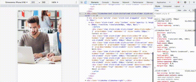
iPhone SE screenshot:
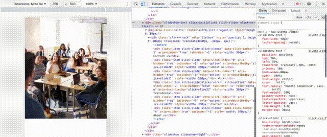
 Moto G4 screenshot:
 DEMO Link