
I’ve been poking around and haven’t really found a clear answer to my question, so here goes:
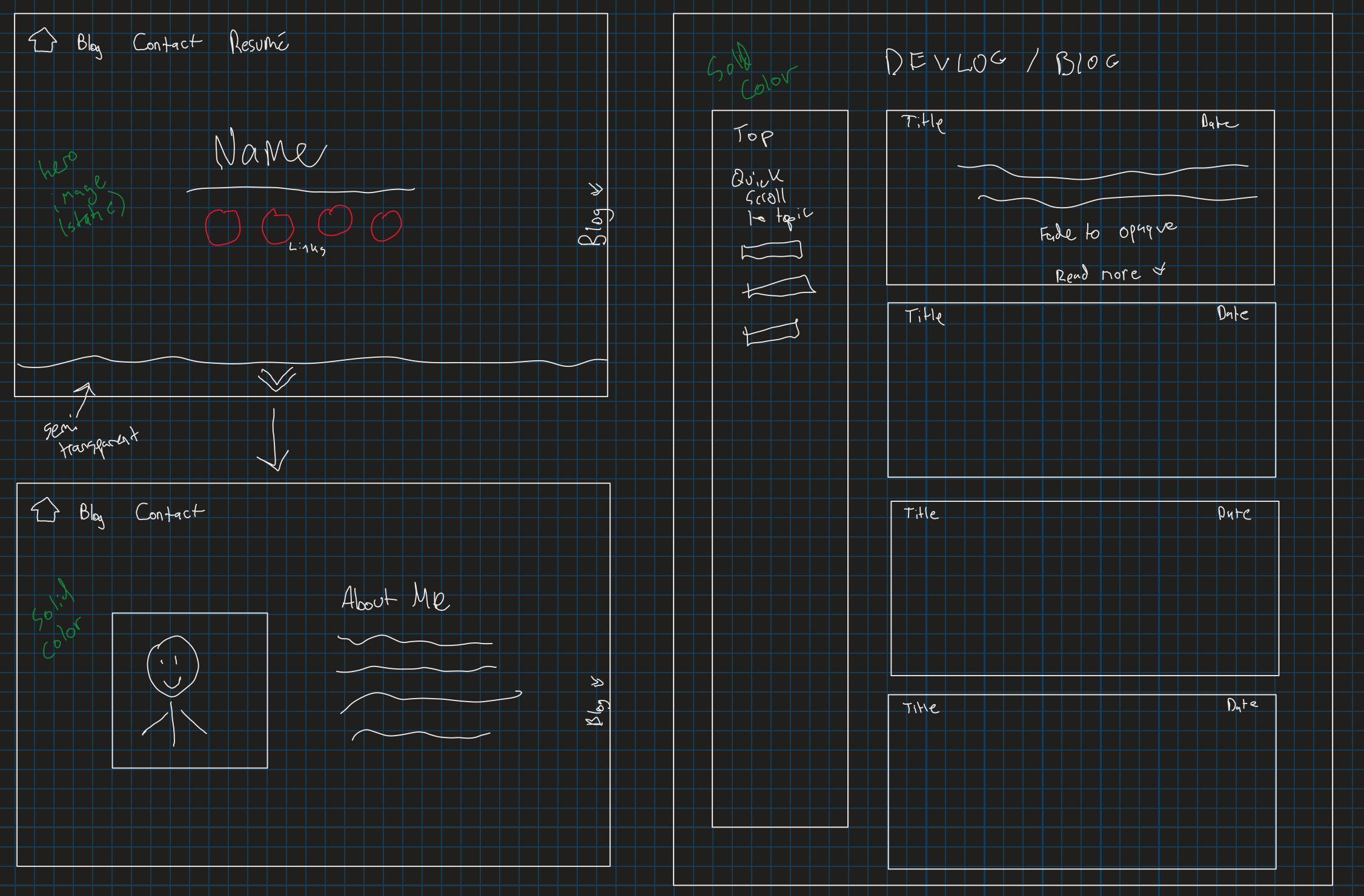
I’m starting to put work into my personal website, and had an idea for a cool implementation. I would like to have a splash page, with a way to scroll down and view an “About Me”, But also be able to scroll to the right to a “blog section”. This wouldn’t be an actual scroll, rather a button pressed that uses js to scroll smoothly to the right.
My current thought process is to set up multiple divs that use 100vh and then set them side-by-side. My question: is there an easier or cleaner implementation of this?
I am including a screenshot for reference
Edit: For some clarification, the idea is that this is all really one page and not contained in separate files. It’s honestly just a gimmick but I thought it might be cool to implement
Advertisement
Answer
I’m not sure if that’s what you’re looking for. But i made that example, just messing around with transform and overflow propertys.
good luck and have fun =)
const container = document.querySelector('.container');
const toBlogButton = document.querySelector('.blogBtn');
const toAboutButton = document.querySelector('.aboutBtn');
const toHomeBtns = document.querySelectorAll('.toHome');

function toHome(){
  container.classList.remove('toBlog','toAbout');
}

toBlogButton.addEventListener('click',()=>{
  container.classList.toggle('toBlog');
})

toAboutButton.addEventListener('click',()=>{
  container.classList.toggle('toAbout');
})

toHomeBtns.forEach(element=>{
  element.addEventListener('click',toHome)
})
* {
margin: 0;
padding: 0;
box-sizing: border-box;
}
body {
overflow: hidden;
}
.container {
height: 100vh;
width: 200vw;
display: flex;
flex-wrap: wrap;
}
.container > div {
height: 100vh;
width: 100vw;
display: flex;
justify-content: center;
align-items: center;
position: relative;
}
button {
padding: 0.3rem;
}
h1 {
color: #ffffff;
}
.splash {
background: green;
}
.splash button:nth-child(2) {
position: absolute;
right: 0;
}
.splash button:last-child {
position: absolute;
bottom: 0;
}
.about {
background: red;
}
.about button {
position: absolute;
top: 0;
}
.blog {
background: yellow;
}
.blog button {
position: absolute;
left: 0;
}
.container {
transition: transform 0.3s ease 0.1s;
}
.toBlog {
transform: translateX(-100vw);
}
.toAbout {
transform: translateY(-100vh);
}<!DOCTYPE html>
<html>
<head>
<meta charset="utf-8">
<meta name="viewport" content="width=device-width">
<title>repl.it</title>
<link href="style.css" rel="stylesheet" type="text/css" />
</head>
<body>
<div class="container">
<div class="splash">
<h1>Splash</h1>
<button class="blogBtn">Blog</button>
<button class="aboutBtn">About Me</button>
</div>
<div class="blog">
<button class="toHome">Home</button>
<h1>Awesome Blog</h1>
</div>
<div class="about">
<button class="toHome">Home</button>
<h1>About Me =)</h1>
</div>
</div>
<script src="script.js"></script>
</body>
</html>